
VMware Fusion: Windows ARM Audit and Evidence Limits
Content Hub Audit: Indexing, Intent, and Search Evidence

One shared visual direction. Six unrelated briefs. Twelve matched initial images, two corrective edits, and an auditable boundary between style and meaning.
Study date: November 9, 2026 · This is a local article preview; publication date and live canonical are not yet confirmed.
Decision Brief: What the Six-Brief Study Actually Establishes
An editorial image can look polished, match a brand palette, and still explain the wrong thing. That is the practical problem behind this experiment. I wanted to know whether AI art direction could preserve a recognizable visual identity across unrelated subjects without producing a string of nearly identical monitors, desks, and carefully lit rooms. I also wanted the production process to leave an audit trail rather than a gallery of selected winners.
The experiment generated 12 initial images from six matched briefs: one independent-prompt version (Condition A) and one version with a frozen shared art-direction guide (Condition B) for each brief. Two guided images received one documented corrective edit each, producing 14 generated assets in total. These are real image outputs with recorded prompts and timestamps, not illustrative mock results. The same image-generation tool handled all requests, although its exact underlying model snapshot and random seed were not exposed.
The central finding is narrow and useful: the guide improved the study’s rubric-defined identity score in five of six initial pairs and tied in the sixth. It did not improve the initial ordinal scores for subject recognition, brief compliance, or photorealistic fidelity. Two guided images looked coherent but missed important subject details. That distinction matters more to me than a single overall aesthetic score.
Evidence boundary: all visual ratings were made through production-aware, model-assisted inspection. No independent human evaluators were recruited, no user preference was measured, and the six pairs were not repeated as independent randomized trials. File-integrity, image-dimension, prompt-register, and time-log checks are a different, more objective kind of evidence. Neither category replaces the other.
Why AI Art Direction Needs More Than a Style Prompt
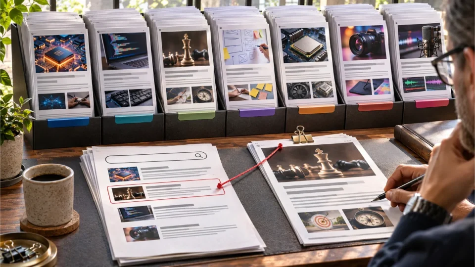
When people discuss AI-generated editorial images, consistency often becomes a shorthand for using the same colors or photographic finish. But a publisher also needs subject specificity: a debugging article should suggest a real debugging operation, an information architecture article should show a meaningful hierarchy, and a virtualization article should communicate that one system runs inside another. A perfectly consistent series that cannot distinguish those ideas is not successful editorial communication.
In this study, I treated AI art direction as a set of controllable visual decisions rather than a rigid image template. The shared guide specified motivated side light, restrained highlights, physically believable materials, a neutral tonal structure with a context-specific accent, credible optics, and a clear focal relationship. Crucially, it did not require every image to share the same setting, camera angle, or equipment.
That difference between identity and repetition shaped the research design. An image of a person working at a debugger may legitimately contain a monitor. So may a hardware virtualization image. The second image should not have to abandon the monitor simply to be different, but the arrangement, visual story, and exact relationship that make each brief intelligible should be distinct. The test therefore assessed individual subject recognition and visual diversity across each six-image set separately.
I did not assume the public website had a formal design system. The research workflow inspected a small sample of seven published editorial covers, one from each content category, and noted recurring screen structures and dark industrial scenes. This was a bounded visual reference, not a site-wide frequency study. No image pixels from the public site were used as generator references; the experimental direction was written anew.
The Test Environment and Frozen Inputs
A reproducible creative experiment needs to identify what was fixed before the outputs existed. The frozen record was timestamped November 9, 2026 at 13:21:58 UTC, before the first experimental image request. It recorded the six briefs, the shared treatment paragraph, the evaluation rubric, the prompt register, the generation sequence, and a limited retry policy. The experimental unit was the individual brief, not a reader, an audience segment, or an article.
| Dimension | Recorded specification or outcome |
|---|---|
| Research question | Can a shared visual direction remain recognizable across six distinct editorial briefs? |
| Conditions | A: independent brief; B: the same brief plus the frozen shared treatment paragraph |
| Generator | OpenAI built-in image generation tool; exact model version and seed not reported |
| Initial requests | 12 total: six A and six B, arranged in three interleaved waves |
| Corrective requests | Two, both applied after initial ratings to guided B images only |
| Actual original files | 14 PNG outputs, each recorded as 1672 × 941 pixels; requested 1600 × 900 in text |
| Measured variables | Eight ordinal visual criteria, coded set repetition, file properties, request latency |
| Independent human raters | 0; production-aware model-assisted evaluation only |
| Reproduction limit | Frozen text and logs can be replayed, but hidden model snapshot and seed prevent exact output regeneration |
The resulting aspect ratio was 1.776833, approximately 0.053% below exact 16:9. Both conditions received that same original image size. The laboratory used centered exact-16:9 previews for review, but kept the raw reported outputs in its evidence archive. A numerical request for dimensions in a prompt should never be mistaken for an exposed generation parameter or an actual measured file property.
Exactly What Changed Between Conditions A and B
For each brief, Condition A received subject-specific requirements, photographic instructions, compositional constraints, and prohibitions against text, branding, and generic decoration. Condition B received that identical prompt, followed by the frozen shared-guide paragraph. The guide bundled lighting, tonal treatment, material finish, background control, and focal emphasis. It was one compound intervention, not five independent feature tests.
This matters for causal interpretation. If an image became cleaner, I cannot attribute the change to side lighting rather than a longer prompt, tighter hierarchy, lower color complexity, or random variation in the generator. The pairing helps isolate the addition of AI art direction as a combined instruction set within this one execution, but it cannot isolate each component of that set or establish what would happen under a new model.
The three generation waves deliberately alternated the starting condition: A01, B01, A02, B02; then B03, A03, B04, A04; then A05, B05, A06, B06. Interleaving limited a simple “all A first, all B later” timing bias, while the study still had only one initial generation per brief per condition. The order and timestamps were preserved rather than selected retrospectively for favorable outputs.
Six Creative Briefs That Could Not Share One Scene
I selected six deliberately different domains so that AI art direction would be challenged by changes in subject, setting, spatial composition, and evidence type. Every assignment required 16:9 framing, plausible physical materials, identifiable subject relationships, legibility at smaller preview sizes, and no visible words, digits, logos, or watermarks. The generator was allowed to use schematic, text-free interface shapes when a literal interface would be inaccurate.
B01 — AI engineering
A standing evaluation cart with one monitor needed to distinguish a source document, an AI-produced answer, and a verification grid containing a flagged row. A generic dashboard would not count as a successful depiction.
B02 — Software development
A compact debugging view needed a breakpoint dot, an execution marker, a paused line, and a watch pane. A screen filled with anonymous code-like lines alone was insufficient.
B03 — Product and strategy
At a physical build station, one reusable-crate handle had to be tested in a fitting jig while an alternative remained visible. This framed a concrete pilot choice rather than an abstract business meeting.
B04 — UX research
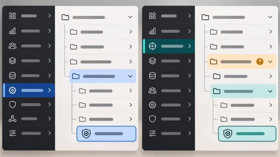
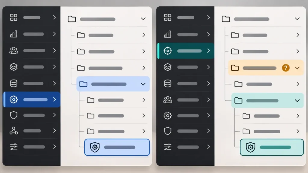
Two separate information architecture trees had to lead to the same shield-shaped destination, with an extra nesting level in one route. These were physical prints, not a user-behavior measurement.
B05 — Technology and hardware
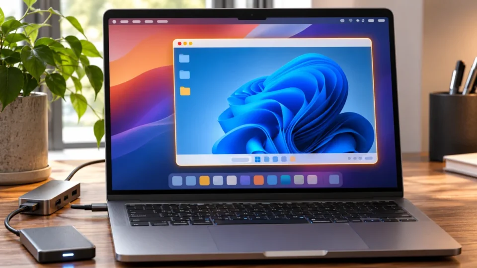
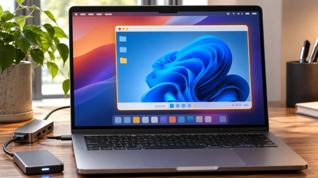
A compact aluminum computer beside one monitor had to show a guest desktop nested inside a host desktop. Screen imagery could suggest operating systems but could not prove processor architecture.
B06 — Digital creation
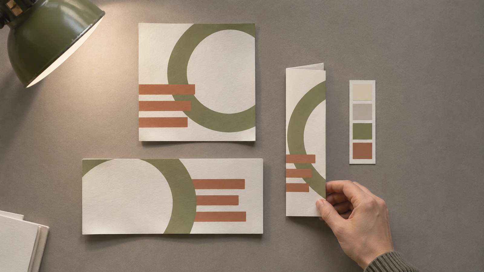
A photographic overhead proofing scene had to show one ring-and-bars motif adapted across square, wide, and narrow folded paper formats, with a hand comparing the treatments.
These requirements intentionally mixed software interfaces, industrial prototyping, physical UX diagrams, virtualization, and graphic production. They also made the study harder to “win” merely by carrying a color grade across six images. A shared editorial finish can support recognition, but a credible subject relationship still has to be present.
The Eight-Criterion AI Art Direction Evaluation Rubric
The frozen evaluator used eight five-level ordinal scales. The scales were anchored to observable weaknesses, and the review recorded criterion-specific reasons. The overall goal was to avoid a single composite number that could conceal a visually coherent but semantically wrong scene. In particular, R4 identity adherence and R2 brief compliance were intentionally different questions.
| Criterion | What was evaluated |
|---|---|
| R1 — Subject recognition | Does the intended technical task become recognizable from visual relationships? |
| R2 — Brief compliance | Are the required objects, roles and central relationships actually present? |
| R3 — Photorealistic fidelity | Are materials, lighting, anatomy and photographic finish believable? |
| R4 — Shared identity | How many of the six written art-direction characteristics are observable? |
| R5 — Set diversity | How many of four coded scene axes overlap with the nearest image in the same set? |
| R6 — Technical quality | Are geometry, continuity, focus and illumination credible? |
| R7 — Editorial usability | Does the important relationship survive a 320 × 180 and then 160 × 90 preview? |
| R8 — Accessibility | Can the essential content be conveyed without relying only on color? |
For strict topic success, the protocol required at least R1 = 4 and R2 = 4. Its photographic threshold was R3 = 4. The guided production acceptance gate included further requirements for identity, diversity, basic usability, and absence of hard defects. A rating of five was not an audience opinion: it meant the image fulfilled a particular prewritten scoring anchor in the model-assisted review.
The rubric also evaluated repetition across four explicit axes: setting, dominant object, viewpoint, and composition structure. This separated repeated equipment from repeated scenes. Color alone was not an automatic failure. I consider this an important practical design decision in AI art direction because an enterprise technology publication can legitimately feature more than one computer without making every computer image a duplicate.
Initial A/B Results: Stronger Identity, Not Better Subject Scores
The paired matrix below contains only the twelve original images. It excludes both later B revisions. This is the fairest comparison supported by the recorded design, because all six A images and all six B images received one initial generation opportunity and no selection among multiple draws.
| Brief | R1 Subject | R2 Brief | R3 Realism | R4 Identity | R5 Diversity |
|---|---|---|---|---|---|
| B01 · AI engineering | 3 → 3 | 3 → 3 | 5 → 5 | 4 → 5 | 2 → 3 |
| B02 · Software development | 5 → 5 | 5 → 5 | 5 → 5 | 4 → 5 | 4 → 4 |
| B03 · Product strategy | 4 → 4 | 5 → 5 | 5 → 5 | 4 → 5 | 5 → 4 |
| B04 · UX research | 4 → 4 | 3 → 3 | 5 → 5 | 4 → 5 | 4 → 5 |
| B05 · Technology hardware | 5 → 5 | 5 → 5 | 4 → 4 | 4 → 4 | 2 → 3 |
| B06 · Digital creation | 5 → 5 | 5 → 5 | 5 → 5 | 4 → 5 | 5 → 5 |
Five guided outputs improved from R4 = 4 to R4 = 5; the hardware image stayed at R4 = 4 in both conditions. Median paired R4 difference was one ordinal level, with no decline. The initial R1, R2, and R3 values were identical in every matched pair. That finding supports a local claim about conformity to a supplied guide, not a claim that visually guided images were more useful or more believable to human viewers.
Three independent scenes used the monitor as a major object. Two independent images—AI engineering and the hardware scene—also shared enough other coded axes to trigger the repetition rule. The guided set passed the frozen set-diversity threshold, but the monitor remained prominent in three guided scenes and plants, mugs, and side lighting recurred. A passing metric does not make those patterns disappear from sight.
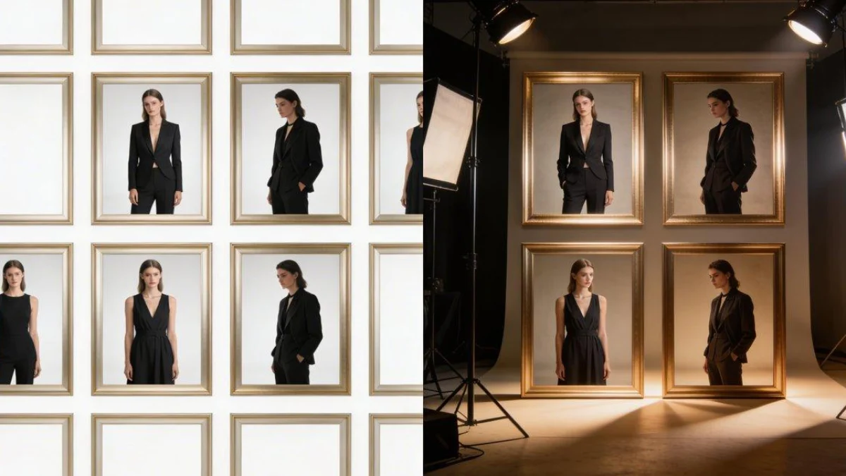
The six-pair evidence montage for this article was assembled from the actual uploaded A and B image files. It is an editorial comparison layout, not newly generated experimental imagery. Keep the original matrix in context when interpreting the pictures: subtle differences within one scoring level may still be visible, and photographs alone cannot communicate all research limits.

What Did Not Change Under the Rubric
No initial pair crossed to a higher subject or realism level simply because the guide was appended. That is not evidence of zero effect in the population, nor proof of equivalence. With one image per cell, a coarse five-level scale, and no masked independent raters, an actual visual difference can easily remain inside one ordinal category. The meaningful statement is that no change was recorded in these three ordinal criteria in these six matched observations.
The comparison is also not a randomized controlled trial with dozens of independent observations. The generator is stochastic, its exact snapshot is hidden, and the study authoring and reviewing process was not independent. The right interpretation of AI art direction here is an auditable production case with explicit controls, not an externally validated success-rate estimate.
Two Revisions Reveal the Difference Between Style and Meaning
The most revealing part of this study came after the initial A/B assessment. Both corrective edits were in Condition B, the guided set, and both were triggered by a missing subject cue rather than poor photographic quality. The originals remain in the evidence archive; the final selection is not substituted into the initial-pair table.
B01: An Attractive Monitor Was Not an Evidence-Grounding Test
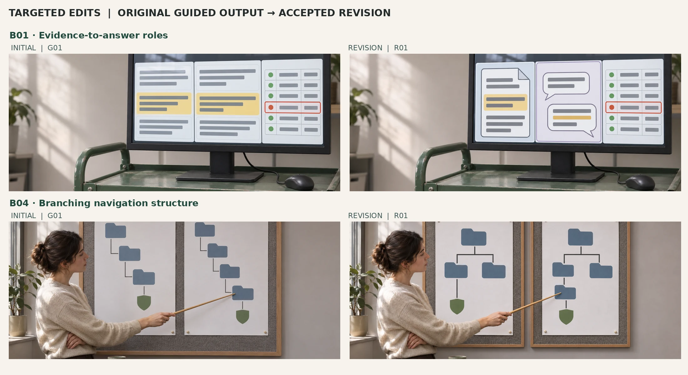
The first AI engineering image showed three visually related interface panels. It looked credible as a photograph, but the source block and generated-answer block used nearly interchangeable layouts. Without a headline, a viewer could not identify which part represented evidence and which represented an answer. The guided initial rated R4 = 5 and R3 = 5, yet R2 remained 3. In this case, AI art direction produced the desired finish while missing the instructional relationship.
The correction retained the cart, monitor, mouse, viewpoint, physical lighting, and verification grid. It changed the left panel into a recognizable document outline and the middle into two answer-bubble shapes. The final review reported R1 rising from 3 to 4 and R2 rising from 3 to 5. It was one logged image edit, not hand-painted pixel restoration. The corrected result gives a stronger explanation of source → answer → verification while remaining a staged illustration, not evidence of any actual model passing or failing a test.
B04: A Navigation Path Is Not Necessarily a Tree
In the original UX pair, the pinned diagrams showed two paths of different lengths ending at a shield icon. They did not show a proper branching hierarchy: both were essentially chains. The photo looked believable and scored highly on visual identity, but a tree-testing article depends on branches, siblings, and alternative categories. A linear path can be an informative diagram for a different topic; here it missed a defining concept.
The guided revision replaced the shared backing with two separate physical boards. Both diagrams contained branches, and one path to the matching shield contained an extra folder. The model-assisted review raised R1 from 4 to 5 and R2 from 3 to 5. Again, the depicted task is explanatory stagecraft, not a record of any real person selecting a navigation node. A photograph of folders cannot establish successful user findability.
These two fixes suggest a disciplined editing principle: correct the missing relationship before changing the palette. In both cases, a photorealistic surface, accurate reflections, and a coherent grade were already present. A generic instruction to “make it more professional” would have missed the defect. The revision prompt named the exact semantic omission and constrained the edit to the affected area.
Photorealistic Fidelity Is a Separate Quality Gate
The guided initial set cleared the R3 realism threshold for all six briefs. The material surfaces were plausible: painted steel around the AI evaluation cart, soft practical illumination at the debugging monitor, actual contact between a molded handle and a fitting jig, pinned paper in the UX room, aluminum around the compact computer, and matte printed proofs in the digital creation scene. Those details matter because they make the work believable, but realism does not establish the truth of the activity being represented.
For the hardware image, a desktop window nested inside a host desktop communicates the virtualization concept. It does not reveal the processor architecture or prove that any operating system, application, or GPU driver was tested. For the product handle scene, a jig and two alternatives suggest a physical comparison, but they do not establish that a pilot build was formally approved. And for the AI screen, source and answer panels are not model responses or evaluation scores. AI art direction should carry those boundaries into both captions and alt text.
The most conspicuous aesthetic exception was B05, the virtualized-desktop scene. The bright blue screen and vivid surrounding colors remained stronger than the guide’s subdued palette. Its R4 stayed at four rather than five in both A and B. That is not necessarily a failure of the topic image: a distinctive operating-system-like desktop is partly identified by an unusual color region. A rigid demand to mute it could have reduced the useful host–guest distinction.
Visual Diversity: Repeat the Finish, Not the Scene
The separate scene audit compared 15 within-set pairs in each of three sets: A initials, B initials, and the final guided selection. A repetition flag required at least three shared structural axes. Only one pair was flagged in the recorded audit: independent B01 and B05, whose principal screen, viewpoint, and centered monitor structure overlapped. No initial guided pair reached that threshold. That result is a useful descriptive signal, but it depends on how the axes were coded.
The stronger argument lies in the actual pictures. The guided sequence moved from a monitor on a mobile metal cart, to an over-the-shoulder debugger view, to a prototype-fitting bench, to separate physical navigation boards, to a nested computer desktop, and finally to an overhead set of printed designs. Some props and lighting treatments recur, and the hardware piece is a color outlier. But the images do not simply recolor one photographic set or replace the content of the same floating glass interface.
Two independent diversity ratings were corrected during a formal repetition pass after the initial ratings were frozen. The preserved early scores for A01 and A05 had R5 = 3; after the overlap was identified, both became R5 = 2. The research preserved the original evaluation snapshot and reported the correction. This is a good example of why AI art direction studies should retain versioned scoring records instead of quietly editing a spreadsheet until it confirms the original hypothesis.
A difference-hash diagnostic inspected all 91 unique pairs among the 14 originals. No pair fell at or below the preregistered Hamming-distance threshold of five. Yet the two original/edit pairs were plainly very similar to a human viewer; the nearest had distances of six and ten. The metric missed exactly the kinds of small targeted changes that mattered. A hash-based flag can help triage duplicate files, but it is not an editorial judgment of whether two compositions tell the same story.
Production Effort: What the Clock Measured and What It Did Not
The generation log measured submit-to-return latency for every request. Median initial latency was 88.365 seconds in Condition A and 93.4835 seconds in Condition B. The two corrective B requests took 43.240 and 45.515 seconds of observed client latency. There were no recorded failed image requests or aesthetic retries during the initial paired generation.
| Measurement | Observed value | Interpretation |
|---|---|---|
| A initial median | 88.365 seconds | Six initial independent requests; includes transport and queue |
| B initial median | 93.4835 seconds | Six initial guided requests; not an isolated causal speed penalty |
| First corrective B edit | 43.240 seconds | One targeted revision; B01 |
| Second corrective B edit | 45.515 seconds | One targeted revision; B04 |
| Initial submission-to-last-return span | 437.874 seconds | Interleaved calls; some overlap |
| First submission-to-last-revision span | 652.572 seconds | Includes review pause; not work hours |
| Measured manual pixel editing | 0 seconds | No manual pixel edits performed; prompting and review untimed |
| Service cost | Not reported | No valid price-per-success computation |
I would not call the guided prompts “faster” or “slower” on these numbers. They are request-level wall-clock observations affected by service queues and transport. Calls overlap, and the active time spent writing prompts, reviewing details, preparing evaluations, and packaging files was not timed. Moreover, only the guided condition received revisions. That is a production selection rule, not a balanced labor-cost experiment.
The frozen design used a weaker proxy: the number of initial images failing common acceptance gates. Three A images and two B images failed those gates, a small difference that did not meet the decision threshold for a material improvement. The study classified the effort hypothesis as mixed or small and explicitly left comparative correction labor untested. For practical AI art direction, this is a reminder to keep generation latency, human attention, revision count, and service billing in separate columns.
What the Image QA and Reproduction Records Can Verify
The source package reports deterministic validation of the 14 original PNG files: each original was 1672 × 941 pixels, readable as eight-bit RGB, and had a distinct SHA-256 digest. The six final guided selections in the study package were byte-identical copies of their chosen originals. The six frozen input documents, twelve original prompt strings, generation sequence, and recorded timing values were checked against the ledger. These checks establish file and process consistency; they do not validate the subjective quality ratings.
There is one extra preservation caveat when using this article package: the image files uploaded into this conversation arrived as RGBA PNG copies. They retain the recorded pixel dimensions, but their bytes and hashes differ from the RGB originals described in the experiment manifest. I independently rechecked the six frozen text-input hashes and the pairwise records, while the original-byte image manifest cannot be independently passed against these re-encoded uploads. If exact archival provenance is required, obtain and retain the untouched study ZIP before using checksum statements about original bytes. The WebP images supplied alongside this article are clearly identified editorial derivatives.
The study attempted an Apple Vision OCR check for visible text and branding, but all fourteen requests returned errors. Consequently, “the images contain no text” is not an OCR-verified guarantee. The review instead records that no clear words, digits, logos, or watermarks were noticed during visual inspection, with the usual limitations of human/model eyesight at small sizes. The file audit and visual inspection must not be collapsed into a single automated quality pass.
A reader can reproduce the protocol—freeze the six briefs and guide, generate the twelve paired prompts in the logged order, preserve every returned output, score with the fixed anchors, and log any corrective edits. Exact pixel reproduction is a different requirement. Without the generator’s versioned snapshot, seed, and all internal settings, identical prompts do not guarantee identical images. That distinction should remain visible in any serious AI art direction report.
Image Alt Text Is an Evidence Claim
An informative image needs a text alternative that conveys what it actually shows. The study’s B03 alt text, for example, can say that one person fits a handle into a jig while another watches. It cannot claim that the product was approved by a decision-maker. For B05, it can describe a nested desktop window but cannot certify the processor inside the depicted machine. This follows the distinction between informative and decorative alternatives in the W3C WAI image guidance.
For an A/B montage like the one accompanying this article, the alt text should identify the comparison, and the nearby table should communicate the actual evaluation findings in text. A short alt attribute cannot responsibly hold the full six-pair rubric. In my view, accessibility and evidence integrity meet at exactly this point: neither readers nor screen-reader users should be asked to infer study results from an uncaptioned image.
A Practical AI Art Direction Contract for Editorial Teams
I would turn these findings into a reusable production contract rather than adopting the exact palette or image scenes as a universal template. The contract begins with subject meaning, then introduces visual identity, and ends with evidence-preserving review. A team can keep the identity guide stable while replacing every scene-specific object and relationship for a new article.
1. Freeze the Subject Relationship First
Write a one-sentence description of what an uninformed reader should be able to recognize: source compared with answer, debugger paused at a breakpoint, handle seated in a jig, or a guest desktop contained inside a host. Specify objects that must appear and relationships that would make the image misleading if absent. These requirements belong to the individual brief, not to the shared style guide.
2. Freeze the Shared Guide Without Freezing Composition
Define photographic finish, light motivation, tonal distribution, material plausibility, contrast at the key relationship, and background restraint. In this study, the guide allowed accents to change with the scene. Keep that flexibility: AI art direction should protect visual identity while preserving an authentic environment for each subject. Forcing identical camera angles, green equipment, or a coffee mug into every frame merely turns consistency into repetition.
3. Compare Initials Before Choosing a Winner
If a control condition is part of the study, generate one initial asset per condition under the frozen schedule. Preserve the first result even if it is weak. Score subject recognition, compliance, and photorealistic fidelity independently of guide adherence. A guided image that scores five for identity and three for compliance is not a completed success just because the photograph looks polished.
4. Correct Semantics With Targeted Edits
Name the specific missing relationship and constrain the edit so unaffected areas are preserved. For this dataset, the effective edits were document versus speech bubbles, and branching tree versus linear chain. Do not substitute an unlogged improved image into the original comparison. Record the revised asset separately so readers can distinguish what the generator did on its first attempt from what a production process eventually accepted.
5. Preserve Every Cost and Evidence Boundary
Track request count, service latency, actual human review effort when timed, revisions, costs when reported, source status, dimensions, and delivery files. Do not sum overlapping request latencies into project hours. If judges know which image came from which prompt, label the evaluation as production-aware. If no independent human participants were recruited, do not imply audience preference. In short, AI art direction becomes auditable only when the attractive image and the unglamorous production record remain connected.
Counterevidence, Threats to Validity, and Unanswered Questions
This study did not test six independent models or six random seeds per condition. It used one initial output for each condition in each brief, with an opaque service snapshot. Because the shared treatment paragraph added multiple constraints and more prompt text, the result cannot tell us whether lighting, compositional instructions, material language, or token count alone drove the observed conformity gains. A different set of images, prompts, or evaluation scales might change the ordering.
The evaluator helped produce the images and knew the A/B assignments, so the identity improvements may partly reflect expectations about the written guide. In fact, R4 explicitly scores compliance with that guide, which makes a higher score easier to achieve by the condition that receives it. This is not inherently a bad measurement, but it is different from measuring whether an uninformed audience recognizes the six pictures as belonging to one visual series. The latter would require masked human judgments.
Subject recognition at thumbnail size is similarly unresolved for real readers. The production-aware reviewer recognized the planned subject and could inspect full-resolution files, so it did not run a truly blind title-free identification experiment. The reduced-size and grayscale checks are useful diagnostics, not proof of assistive-technology compliance or comprehension by people who did not see the briefs.
Selection bias also matters. After two guided corrections, all six selected B images met the frozen acceptance gates, but A received no analogous revision opportunity. Comparing six post-edit B successes against six untouched A initials as if they were equally treated conditions would overstate the guide’s value. A future comparative effort study should permit equivalent bounded edits in both arms, measure active human editing time, and evaluate the resulting final assets independently.
Finally, these are staged photographic depictions. They are not screenshots of actual software tests, observed UX participant sessions, product approval records, or historical operating-system verification. The study measures generated image properties under a particular prompt design. Any claim about customer preferences, business performance, or technical system outcomes would require new evidence.
What a Stronger Follow-Up Experiment Would Need
The next iteration of AI art direction research should separate two questions that this pilot intentionally bundled: whether a common guide increases independent recognition of series identity, and whether it reduces total editorial labor without weakening subject clarity. The first needs blinded human raters; the second needs balanced production conditions and real active-time capture.
- Replicate the same six briefs with several draws per condition and, when available, a pinned image-model version and recorded settings; preserve unsuccessful generations.
- Use neutral image identifiers and genuinely independent, consenting human assessors who do not know which condition produced an asset; test both individual subject recognition and set-level identity.
- Allow equivalent revisions in A and B with the same cap, while tracking prompt-writing time, review time, retouching time, request duration and actual billing.
- Separate the guide components if the goal is to attribute effects to light, material finish, palette, or compositional rules rather than the entire intervention bundle.
- Reassess small-image legibility and accessibility using a task-based evaluation and assistive-technology checks, not just a designer inspection.
- Keep the negative cases and disagreements visible so the experiment remains useful even if the next model or prompt structure changes the results.
I would not treat a future failure of the identity hypothesis as wasted effort. If a more rigorous trial shows that minimal, topic-specific briefs already produce enough brand consistency, that information can simplify production and reduce constraints. Research is valuable precisely when its method permits the working assumption to be wrong.
Knowledge Check: Reading the Study Without Overclaiming
Does five of six R4 improvements prove audiences prefer Condition B?
No. R4 measured conformity to a known guide, and the reviewer was production-aware. Audience preference, independent series recognition and statistical significance were not observed. Those require different measurements.
Why were two guided images revised if all six passed the realism threshold?
Because B01 lacked a clear source-versus-answer distinction and B04 lacked genuine tree branches. Photographic credibility did not establish compliance with the subject-specific visual brief.
Can the median request times establish that the guide increases production cost?
No. The medians include queue and transport time, calls overlapped, active review work was untimed and only guided outputs received revision opportunities. They are descriptive request latencies, not comparative production costs.
Can another creator reproduce the exact same image files from the frozen prompts?
Not necessarily. The prompts and procedure can be replayed, but the model version, seed and generation settings were not exposed. For pixel-accurate provenance, the preserved original file bytes matter.
Key Terms
| Term | Meaning in this study |
|---|---|
| Art direction | The shared, written visual constraints that guide finish, lighting, tone, material and focus |
| Matched brief | One subject assignment represented once in each initial prompt condition |
| Initial output | The first successfully returned image for a frozen prompt slot, before corrective edits |
| Guided condition | The original subject prompt plus the exact shared treatment paragraph |
| Ordinal rubric | Ordered judgment levels with explicit anchors; not an interval-scale measurement |
| Set diversity | Differences in setting, dominant object, viewpoint and composition across six scenes |
| Production-aware review | Image scoring by an assessor familiar with the prompts and conditions |
| Exact reproducibility | Reproducing unchanged file bytes; not guaranteed by replaying stochastic image prompts |
The Result I Would Carry Into the Next Production Cycle
The six-brief experiment did not establish that a shared guide makes AI-generated images universally better. It demonstrated a narrower practical result: AI art direction increased rubric-defined visual-identity adherence in five matched initials, with no observed increase in subject, compliance, or realism ratings. A guided series could remain compositionally varied, but two images still needed specific semantic repair. Those repairs are the most actionable lesson in the evidence.
I would keep using a compact art-direction contract, especially the instruction to preserve realistic materials and a clear subject relationship. I would also keep reviewing every image against its actual article claim. A beautiful visual can be unsuitable precisely because it looks so finished that its missing information is easy to overlook. The right final question is not “Does this image match the series?” but “Does it match the series and communicate the particular thing this article needs to say?”
Sources, Research Records, and Related Reading
The experiment’s primary evidence consists of its frozen six briefs and art-direction guide, 12 initial image files, two corrected guided files, prompt and generation logs, rubric-level ratings, pairwise comparison and repetition registers, original-file audit, correction history, and final selection. The accompanying study bundle is a reproducibility reference, not evidence that the findings generalize beyond these six pairs.
For the broader editorial workflow, see Creative Pipeline: Quality Beyond Folder Structure, which distinguishes file-property checks from human semantic review. The W3C WAI Images Tutorial provides an external basis for describing informative images, while Google Search Central’s Article structured-data guidance explains why article images and dates should correspond to actual publicly accessible assets.
Browse the wider Digital Creation articles and Articles index for related work on visual production, interface evidence, and technical publishing.
Author’s Note
I approached this as an editorial engineering problem rather than a contest for the prettiest AI image. The research outputs were created with OpenAI image generation and evaluated through a production-aware model-assisted process; no independent human panel took part. I am retaining the failures, corrections, and limits because those details are necessary to understand what the method actually established. For future updates and technical work, see my about page, GitHub, LinkedIn, and X profile.