


Apple Silicon Compatibility: ARM, x86 and Virtual Machines

Digital Brand Strategy: Build Trust Through Evidence

A visual identity can look convincing in a brand presentation and become surprisingly difficult to recognize once it moves into a mobile interface, a social media graphic, or a video sequence. The colors may be identical, the logo may be present, and the typography may come from the approved brand guidelines. Yet the experience can still feel inconsistent because the relationship between these elements changes from one medium to another.
This is why I believe a visual language should be designed as a system of relationships rather than a collection of reusable graphic assets. Consistency does not mean placing the same composition on every surface. A static poster, an interactive interface, and a moving image serve different purposes. They have different spatial constraints, attention patterns, accessibility requirements, and ways of communicating information.
A composition that works beautifully as a landscape editorial image may lose its hierarchy when reduced to a narrow mobile screen. A decorative visual motif that helps establish personality in a campaign may compete with actionable controls in a user interface. A title treatment that remains readable in a static graphic may become difficult to follow when placed over moving footage. The identity elements are still present, but the design no longer performs its intended function.
My central argument is that an effective visual language requires two complementary forms of consistency: stable identity principles and adaptable composition rules. The first explains what makes the work recognizable. The second explains how that identity responds to format, content, interaction, and context without losing its character.
In this article, I will examine the relationship between visual identity, brand guidelines, design systems, responsive visual design, and cross-platform creative direction. I will also introduce an Invariant–Adaptive Visual Language Framework for distinguishing what must remain recognizable from what should change between static graphics, UI, and video. The illustrative examples are original design concepts, not claims of measured commercial performance or completed client experiments.
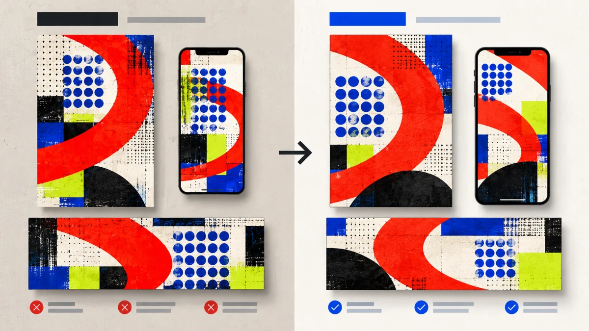
Decision Brief: How Should a Visual Language Survive Different Media Formats?
The problem: Visual identity systems often define assets and stylistic preferences without providing enough guidance for adapting composition, hierarchy, and behavior across different media.
The recommended approach: Establish recognizable identity principles, distinguish their essential characteristics from format-dependent decisions, and evaluate each adaptation against the communication task of its medium.
The expected value: Creative and product teams can produce recognizable yet functional expressions across static graphics, interfaces, and video without mechanically reproducing the same layout.
The limitation: Shared design tokens and brand guidelines cannot guarantee visual consistency or usability. Professional judgment, accessibility testing, production constraints, and review of actual deliverables remain necessary.
What Is a Visual Language in Digital Design?
A visual language is the coordinated use of visual elements and design relationships to communicate meaning, establish identity, and support recognition. It can include color, typography, shape, proportion, imagery, iconography, spacing, composition, and principles governing how those elements interact.
Individual elements rarely define a complete visual identity by themselves. A color may appear in many unrelated brands. A typeface can communicate differently depending on scale, weight, spacing, and the surrounding composition. A geometric shape can function as a decorative mark, navigation element, illustration component, or framing device. The system emerges from how these choices are organized and repeated.
For professional digital creation, I would distinguish a visual language from three related concepts. A visual identity expresses the recognizable character of a brand, product, or creative property. Brand guidelines document how that identity should be used. A design system can translate selected decisions into reusable foundations, components, patterns, and implementation resources.
These concepts overlap, but they are not identical. A brand can have recognizable graphic assets without possessing a sufficiently documented system for adapting them to an interface. A product can have an extensive component library while lacking a distinctive editorial or creative identity. A brand guide can maintain logo placement and colors while saying very little about information hierarchy in mobile layouts.
IBM’s Carbon Design System illustrates a useful relationship between these concepts. Carbon is grounded in the IBM Design Language and provides foundations, components, patterns, code, and guidance for digital products. Its different applications share a recognizable foundation while adapting to their respective needs.
I would take that principle further when considering static design, interfaces, and video together. The underlying identity can remain recognizable while its expression changes substantially according to the medium.
Visual Consistency Is Not Visual Repetition
Imagine a creative team designing a promotional poster for a digital product. The composition uses an oversized headline, a dramatic diagonal shape, generous negative space, and a limited color palette. The result has strong visual hierarchy because the reader can understand the intended message at a glance.
Now imagine using that same layout in a mobile application. The oversized headline may occupy too much vertical space. The diagonal shape may interfere with form fields. The negative space that created elegance in the poster may push essential controls below the visible area. The composition remains recognizable, but it no longer serves the user.
Visual consistency should preserve the relationships that define an identity without reproducing decisions whose effectiveness depends on a particular format.
In other words, the system should explain not only what elements look like, but what those elements are supposed to accomplish. A visual motif may consistently express movement or exploration, while its placement, scale, and prominence change according to context.
Why Style Principles Matter More Than Asset Reuse
Asset reuse is valuable for efficiency and consistency. Logos, icons, illustrations, templates, and other reusable materials reduce unnecessary variation. However, reuse becomes restrictive when it substitutes for understanding the intended visual principles.
A fixed artwork may preserve pixel-level similarity across two surfaces while weakening the intended communication on one of them. Conversely, two compositions can share no identical background image and still feel unmistakably related because they preserve the same typographic character, color roles, shape vocabulary, and balance of visual emphasis.
For this reason, I would document principles such as strong editorial contrast, restrained geometric forms, generous breathing room, or a consistent relationship between typography and imagery. The principles should be concrete enough to guide creative decisions, but not so prescriptive that every deliverable becomes another copy of the same arrangement.
The Difference Between Invariant and Adaptive Design Decisions
The central distinction in my approach is between invariant principles and adaptive composition decisions. An invariant principle establishes something that should remain recognizable across the identity. An adaptive decision determines how that principle is expressed in a particular environment.
This separation is not equivalent to dividing every design element into permanently fixed and completely unrestricted categories. Some identity characteristics have both protected and adaptable properties. A brand color may be part of the invariant palette, while its usage as a background, accent, or decorative element changes by medium.
Likewise, a typographic family may be protected, while sizes, line lengths, hierarchy, and responsive behavior vary. A recognizable shape may retain its basic geometry while its position and orientation change to support different compositions.
Which Visual Identity Principles Should Remain Stable?
I would begin with the characteristics that make the identity distinguishable from other work. Depending on the design, these may include a particular palette relationship, typographic voice, recurring shape vocabulary, illustration treatment, photographic art direction, or consistent use of contrast and negative space.
A useful invariant is more precise than a vague instruction such as “keep the design modern.” Modernity is a broad aesthetic judgment and gives little guidance when designers must choose between competing layouts. A stronger principle might specify that one dominant visual form establishes hierarchy, supporting elements remain comparatively restrained, and major compositions maintain a recognizable relationship between type and imagery.
These principles should be supported by actual examples. If a principle cannot be recognized in finished deliverables or used to evaluate a design decision, it may be too abstract to function as a reliable rule.
Which Composition Decisions Should Remain Flexible?
Format-dependent decisions include aspect ratio, crop, typography scale, layout density, information order, safe areas, visual focal point, and the amount of decorative material a surface can support.
A square campaign graphic might place a large abstract form behind its headline. A vertical video may use the same form as a controlled framing device. A mobile UI may reduce it to a small decorative accent that does not interfere with controls or content.
The visual identity remains connected through a shared grammar rather than through identical coordinates or artwork dimensions.
This is also why I would not define brand consistency as the percentage of identical pixels between two assets. Such a measure could reward mechanical duplication while overlooking whether the composition remains readable, accessible, and meaningful.
Some Rules Are Contextual Constraints, Not Brand Preferences
There is a third category that designers should not ignore: requirements imposed by the medium or the user’s needs. Accessibility, legibility, platform behavior, file specifications, and essential interaction patterns cannot always be treated as optional creative preferences.
For example, a vivid accent color can be useful in a poster but fail to provide sufficient contrast for small interface text. An interaction state must remain identifiable even if the preferred brand palette does not naturally accommodate it.
The Web Content Accessibility Guidelines 2.2 establish requirements for web content, including minimum contrast criteria for text and essential non-text visual information. The relevant requirements apply according to the content and interface characteristics, rather than whether an identity guide describes a particular color as essential.
I would therefore treat accessibility and meaningful task completion as design constraints that take precedence over preserving an exact decorative treatment.
The Invariant–Adaptive Visual Language Framework
I propose the Invariant–Adaptive Visual Language Framework as a practical method for evaluating whether a visual design system can retain its identity across different media formats. It is my analytical synthesis of established design-system principles, responsive layout guidance, accessibility requirements, and creative direction practices. It is not a formally validated industry standard.
The framework separates decisions into four connected layers: identity grammar, composition adaptation, medium constraints, and recognition review.
Layer 1: Define the Identity Grammar
Before designing multiple formats, describe the characteristics that make the visual identity recognizable. These should include the most important relationships among color, type, shape, image treatment, and hierarchy.
I would document not only the assets but also the rules that explain their use. If a recurring circular motif represents continuity, define its acceptable transformations. If a typographic treatment establishes a distinctive editorial personality, explain the essential characteristics of that treatment rather than prescribing one headline size everywhere.
Identity grammar gives designers a common reference for evaluating whether a new composition still belongs to the same visual system.
Layer 2: Define the Adaptive Composition Rules
Determine which properties change with aspect ratio, viewing distance, content density, interaction requirements, and temporal presentation.
For static graphics, the adaptation may involve cropping and hierarchy. For interfaces, it may involve responsive layout, density, interactive components, and semantic content. For video, it may involve the placement and duration of graphic elements, the relationship between text and footage, and the order in which information becomes visible.
The purpose of these rules is not to automate every design decision. It is to reduce arbitrary variation while leaving room for medium-specific communication.
Layer 3: Establish Medium-Specific Constraints
A visual language should operate within the functional limits of each medium. Static images have fixed compositions and export requirements. Interfaces must support interaction, reflow, focus, and accessibility. Video involves changing frames, timing, transitions, text visibility, and potentially different display environments.
I would describe these constraints separately from brand preferences. A platform’s safe area is not a creative preference. A required minimum contrast ratio is not merely an aesthetic recommendation. A video export color space is not interchangeable with an arbitrary RGB palette value.
When the medium imposes a constraint, the team should adapt the visual expression without abandoning the underlying identity.
Layer 4: Review Recognition and Functional Integrity
Finally, evaluate whether the adapted deliverable remains recognizably connected to the system and whether it performs its intended communication task.
Recognition cannot be established simply by counting reused elements. A composition may preserve every approved graphic asset while feeling visually incoherent. Another may simplify the identity substantially and remain recognizable because the essential relationships survive.
I would review the adapted work for identity, hierarchy, readability, accessibility, and medium suitability. Those judgments should remain distinguishable from measured audience recognition, which would require an actual study.
| Design dimension | Identity principle to preserve | What may adapt | What requires validation |
|---|---|---|---|
| Color | Palette relationships, semantic roles, and characteristic contrasts. | Background distribution, accent proportion, color-space conversion. | Readability, contrast, and output appearance. |
| Typography | Typographic personality, hierarchy logic, and approved families. | Size, line length, alignment, weight distribution, wrapping. | Legibility, text scaling, and information hierarchy. |
| Shape vocabulary | Recognizable forms, proportions, and visual relationships. | Scale, crop, rotation, position, and level of detail. | Recognition and interference with content or controls. |
| Imagery | Art direction, subject treatment, tonal character, and composition principles. | Crop, framing, focal point, visual density, and format ratio. | Meaning retention and appropriate visual emphasis. |
| Layout | Hierarchy, balance, rhythm, and intentional negative space. | Grid, spacing, alignment, section order, and content density. | Comprehension and task completion. |
| Video expression | Recognizable graphic style and narrative identity. | Title placement, graphic sequencing, framing, and transitions. | Text visibility, platform requirements, and accessibility. |
The framework becomes useful when a creative team can explain why an adaptation differs from the original. The relevant question is not “Why did you change the layout?” It is “Which identity principle does this new layout preserve, and which medium-specific requirement makes the change appropriate?”
Design Tokens and Brand Guidelines: What Can Actually Be Standardized?
Design tokens provide one useful technical mechanism for maintaining shared visual decisions. A token can represent a design value or a semantic role, such as a primary text color, accent color, spacing unit, or typography definition. A consuming application or design tool can map those definitions to its own implementation.
The Design Tokens Format Module 2025.10 describes a vendor-neutral JSON-based representation for exchanging design tokens. The specification includes concepts such as token types, groups, aliases, and composite values. The October 2025 release is a final W3C Community Group report, not a formal W3C Recommendation.
This distinction is important because design tokens provide structured design information without replacing visual judgment. They are effective for decisions that can be expressed as reusable values or relationships. They do not automatically establish art direction, responsive composition, image cropping, or the readability of a moving title over changing footage.
Use Semantic Roles Rather Than Unexplained Color Values
For example, a raw palette token may represent a shade of blue. A semantic token such as a primary interactive accent represents a role in the interface. These are different levels of meaning.
If the identity palette changes, semantic roles can help teams update the system while preserving the intended relationships. But the same semantic role does not necessarily translate directly to a video editing timeline or a print composition.
I would maintain an authoritative palette definition and document medium-specific interpretations. The web interface may use semantic color tokens. A static export may apply corresponding art-direction values. Video assets may require additional color management and output-specific checks.
The goal is coordinated intent, not the assumption that every application will render identical RGB numbers with identical visual results.
Color Consistency Also Depends on Output Conditions
Color is particularly sensitive to the difference between design intent and technical reproduction. A palette value can be consistent in the source document while appearing different across displays, export settings, color profiles, and print environments.
Adobe’s guidance on color models and color spaces explains how RGB and CMYK workflows represent color differently and how device gamuts affect reproducibility. Its color management documentation further describes why matching numerical color values does not guarantee identical appearance across devices.
This means a professional visual design system should include color-management considerations where the production workflow requires them. It should identify relevant output targets, color profiles, and review conditions rather than promising universal visual equivalence.
The same principle applies to video. Adobe’s guidance on color management in video layers describes how mismatches between video footage and document color spaces can introduce unexpected color shifts. A shared palette is useful, but it does not eliminate the need for appropriate conversion and validation.
Brand Guidelines Need Rules for Adaptation, Not Only Restrictions
Traditional brand guidelines often establish logo clear space, color specifications, typography, imagery, and examples of prohibited usage. Those rules remain useful, particularly when many contributors create assets for the same identity.
However, I would extend the guidelines with controlled adaptation examples. What should happen when the format is extremely narrow? When a mobile layout cannot accommodate a full graphic treatment? When text appears above footage? When the identity is expressed through a button, form, or interactive card?
The guide should explain the principle behind each decision so designers can respond to unfamiliar formats without treating every new composition as an exception requiring fresh approval.
Adapting a Visual Language to Static Graphics and Social Formats
Static visual design offers considerable control over composition. A designer can position every element precisely, determine the relationship between typography and imagery, and compose around a fixed focal point. That freedom makes static formats useful for establishing a strong graphic identity.
But even among static media, one composition does not automatically work at every aspect ratio. A horizontal editorial graphic, a square carousel slide, and a vertical promotional image create different spatial problems.
I would preserve the intended emphasis while allowing the arrangement to change. If a bold typographic block and a recurring curved shape establish the identity, they can remain related without occupying the same coordinates or proportions in every version.
Cropping Should Preserve Meaning, Not Just Fit the Canvas
Resizing a graphic and recomposing it are different operations. A simple scale transformation changes dimensions while preserving the original arrangement. Recomposition may change the crop, spacing, relative sizes, and placement of key information.
The MDN guide to responsive images describes this distinction as an art-direction problem: a different crop or image composition may be needed for a narrow display rather than merely delivering a smaller version of the same file.
I would apply the same reasoning beyond websites. A vertical format may need a closer crop, a shorter headline, and a more concentrated visual focal point. A wide editorial format can support a more expansive relationship between image and text.
The key is that these changes serve the same message and visual identity while respecting different viewing conditions.
Visual Hierarchy Must Survive Format Changes
Strong brand consistency does not compensate for unclear information hierarchy. If a headline is dominant in one composition but becomes subordinate to decoration in another, the identity may remain recognizable while the communication suffers.
I would define the intended hierarchy before adapting a layout: primary message, supporting context, relevant identity marker, and optional decoration. Their positions can change, but the relationship between what matters most and what supports it should remain understandable.
This also provides a useful reason to simplify. A small graphic may need fewer decorative elements than a larger poster, not because the visual language is weakened, but because reducing noise protects its most important expression.
Translating a Visual Identity Into a Functional User Interface
A visual identity enters a different environment when it becomes part of a user interface. In static communication, visual emphasis can be the primary objective. In UI design, visual choices must also support tasks, states, interaction feedback, navigation, and accessibility.
This creates a meaningful tension. Distinctive visual design can contribute to product recognition, but excessive decorative treatment can interfere with controls, information density, or the user’s understanding of what is actionable.
My preference is to let identity establish the product’s visual character without allowing it to override the interaction model. A strong visual language should make the product feel distinctive while leaving the behavior of essential interface elements understandable.
Responsive Visual Design Requires Recomposition
Responsive UI should not be treated as the same desktop layout reduced to fit a smaller screen. The arrangement of elements may need to change according to available width, content priority, and interaction requirements.
Google’s Material Design guidance for responsive UI describes how flexible grids, breakpoints, and layout changes help interfaces adapt across screen sizes. The underlying principle is that a design system can preserve its identity while its structure responds to the display.
A decorative motif can be prominent in a spacious desktop interface while becoming minimal on mobile. A typographic hierarchy can preserve its relative logic while changing actual sizes and line breaks. A content card can move from a multicolumn arrangement to a linear sequence without abandoning the visual identity.
I would evaluate these changes through real content and representative tasks. Responsive consistency is not established by looking at empty templates.
Accessibility Must Be Part of Visual Language Governance
Visual identity guidelines should not force interface teams to use color combinations that make information difficult to perceive. Under WCAG 2.2 Level AA, ordinary text generally requires a contrast ratio of at least 4.5:1, with 3:1 for qualifying large text. Essential non-text visual information in UI components can require a 3:1 contrast ratio against adjacent colors.
These requirements have exceptions and scope conditions, so they should be applied according to the relevant success criteria rather than reduced to a blanket statement that every graphic element needs the same contrast ratio.
The W3C guidance on images of text also explains why actual text is usually preferable to words embedded in images for web interfaces: users can resize, adapt, and access real text more flexibly.
For a cross-platform design system, I would document accessible variants, acceptable background combinations, semantic color roles, and rules for decorative elements near controls. Accessibility should shape the system before an implementation problem forces the team to create exceptions.
Brand Expression and Interface States Should Not Be Confused
A recurring decorative shape may be recognizable across static graphics, but using it around every interface control can weaken affordances and create uncertainty about what users can interact with.
I would maintain a distinction between decorative identity elements and functional interface elements. Buttons, focus indicators, validation messages, navigation controls, and state feedback need clear behavioral meaning.
Brand personality can influence these elements through typography, spacing, color relationships, and appropriately designed component treatments. It should not obscure their purpose.
Maintaining Brand Consistency in Video Without Copying Static Layouts
Video introduces a temporal dimension that static images and conventional interface layouts do not share. Graphic elements appear, change, interact with footage, and disappear over time. The audience may not control how long each composition remains visible.
This makes video branding a distinct adaptation of the visual language rather than a sequence of static posters. Typography, graphic motifs, framing, and color treatment must work within the duration and narrative structure of the video.
I would preserve the underlying visual identity while allowing title cards, lower-thirds, supporting graphics, and framing devices to respond to the subject and platform.
Typography and Graphic Motifs Need Temporal Context
A typographic treatment that works in a static poster may be too dense when displayed briefly in a video. A title can use the same approved typeface and visual character while requiring different line breaks, sizes, and positioning to remain readable over footage.
Similarly, a distinctive geometric motif can appear as a framing device or transition element without occupying the same position throughout an entire video. The important question is whether the motif reinforces the identity and the communication rather than distracting from them.
The timing, cognitive demands, and accessibility implications of motion deserve their own detailed analysis. For this article, the relevant principle is narrower: visual consistency in video depends on preserving recognizable graphic relationships while adapting them to a time-based medium.
Video Format Changes Are Also Composition Decisions
Horizontal, square, and vertical video formats may require different framing, title positions, and visual emphasis. Simply cropping a completed horizontal video into a vertical frame can remove important content or make supporting graphics ineffective.
I would plan key format adaptations during the creative development process. The system should define which visual elements remain essential and which may move, simplify, or disappear when the canvas changes.
It should also distinguish decorative graphics from information that must remain understandable. If a title is essential to the message, the adaptation needs to preserve its meaning rather than treating it as an optional design element.
Finally, color-management and export conditions should be checked for the intended output. Brand consistency cannot be assumed solely because the graphics share the same source palette.
Illustrative Before and After: One Identity Across Three Formats
To make the framework concrete, consider a fictional visual identity developed for an editorial technology publication. This is an original design exercise, not a rebranding project for a real client or a claim about measured recognition.
Its proposed visual language uses an expressive curved form, cobalt blue and coral-red as major identity colors, an off-white field, strong dark accents, a restrained secondary highlight, and a consistent relationship between large forms and smaller repeated dots. Typography is based on a clear geometric character with deliberately strong hierarchy.
Now imagine the creative team needs to produce three outputs: a static promotional poster, a mobile article interface, and a horizontal editorial video graphic.
Before: Reusing One Artwork Instead of Adapting the System
In the weaker implementation, the poster establishes a distinctive layout, but the team exports the artwork into the other formats with minimal adaptation. The mobile composition contains excessive decoration and cramped content. The video treatment uses the same positioning and typography even when the footage requires a different visual balance.
The team has maintained the original artwork but not the functional intent of the visual language.
After: Preserving the Identity While Adapting Its Composition
In the revised hypothetical approach, each format retains the shared color relationships, recurring curved geometry, dot pattern, and typographic character. The compositions change according to purpose.
The poster emphasizes one large visual gesture. The mobile interface reduces the decorative motif, protects reading order and controls, and uses the identity primarily through typography, semantic colors, and restrained details. The video graphic preserves the visual vocabulary while allowing the title and supporting forms to respond to the framing and information sequence.
| Medium | Before: Mechanical reuse | After: System-based adaptation |
|---|---|---|
| Static poster | A strong reference composition used as the required layout for every other asset. | A distinctive primary expression used to define identity principles, not universal coordinates. |
| Mobile UI | Oversized decorative shapes, dense typography, and limited space for functional content. | Reduced decorative emphasis, readable hierarchy, responsive spacing, and clear controls. |
| Editorial video | Static graphic placement repeated regardless of footage, timing, or information needs. | Consistent type and shape vocabulary with adaptable framing, title placement, and visual sequence. |
| Identity recognition | Dependence on repeating the same artwork or logo placement. | Recognition intended through recurring color relationships, shapes, typography, and compositional principles. |
| Creative governance | Approval based mainly on similarity to the original artwork. | Review based on identity principles, medium suitability, and functional requirements. |
The proposed adaptation illustrates an important distinction, but it does not prove that viewers would recognize the brand more consistently. That would require a defined recognition study, appropriately selected participants, and comparable test conditions.
What the example demonstrates is a more defensible design method. It gives creative teams a way to explain the choices made when adapting the identity rather than relying on similarity as the only approval criterion.
How to Evaluate a Cross-Format Visual Design System
A visual language should be evaluated through its finished expressions, not only through the quality of its design documentation. A system can be beautifully specified and still fail when multiple contributors use it in real production contexts.
I would review both identity continuity and functional suitability. These dimensions are related but independent. A deliverable can be recognizably on-brand while failing its communication task. Another can be technically accessible and clear while feeling disconnected from the intended identity.
Evaluate Identity Continuity Without Inventing a Recognition Score
I would ask whether the deliverable preserves the intended relationships among the primary colors, typography, shapes, and compositional rhythm. Which characteristics make it recognizable? Have any essential relationships been altered? Is the design still coherent when the logo is removed?
These questions support professional design review. They should not be confused with empirical brand recognition testing.
If the organization needs evidence that its identity is recognized across formats, it should plan an appropriate study with defined stimuli, participants, measures, and limitations. An internal design team’s agreement is useful for governance, but it is not proof of audience recognition.
Evaluate Each Format Against Its Communication Task
For a static graphic, I would examine focal point, text readability, information hierarchy, crop quality, and whether the intended message remains understandable.
For a user interface, the evaluation should include responsive behavior, readability, interactive states, task clarity, and relevant accessibility requirements. These cannot be established through visual inspection alone when behavior and interaction are part of the intended experience.
For video, the review should consider title visibility, framing, color integrity, essential information, and whether visual elements compete with the material being presented.
The format-specific review should use actual deliverables, not only idealized templates. Content length, unfamiliar imagery, narrow screens, and unusual combinations of elements often expose weaknesses that a carefully prepared showcase does not reveal.
Distinguish Intentional Adaptation From Design Drift
Design drift occurs when repeated local choices gradually weaken the consistency of the overall system. A creative team may introduce slightly different colors, typography treatments, icon styles, or graphic proportions for legitimate reasons in individual projects. Over time, the accumulated differences can make the identity harder to maintain.
Not every deviation is harmful. New formats can reveal limitations in the original guidelines, and a system that cannot evolve may become increasingly unsuitable for its products or audiences.
I would distinguish three outcomes: an approved adaptation consistent with the identity, a justified change requiring an update to the guidelines, and an inconsistent implementation that should be corrected.
This distinction helps teams avoid both uncontrolled visual variation and unnecessary rigidity.
A Practical Visual Language Review Matrix
| Review criterion | What to inspect | Reason to revise |
|---|---|---|
| Identity continuity | Recognizable type, palette relationships, motif, and art direction. | Key identity characteristics are missing or contradicted. |
| Visual hierarchy | Primary message, supporting information, and decorative emphasis. | Decoration competes with the information or task. |
| Format suitability | Aspect ratio, crop, reading conditions, and layout constraints. | A reused composition performs poorly in the new medium. |
| Accessibility | Relevant contrast, readability, semantics, and functional clarity. | Identity treatment interferes with accessibility requirements. |
| Technical output | Color profiles, image clarity, supported formats, and export integrity. | Production output materially changes the intended appearance or meaning. |
| System governance | Approved assets, permitted variations, and decision ownership. | Teams cannot explain whether a variation is intentional or inconsistent. |
The matrix should not be reduced to one weighted quality score. A visually distinctive design cannot compensate for an inaccessible essential control. A successful export does not establish that the graphic communicates effectively. Each criterion supports a different judgment.
Creative Direction and Governance Without Making the System Rigid
Cross-format consistency becomes more difficult as the number of contributors and delivery channels grows. Designers, marketers, developers, video editors, and external partners may all interpret the same visual identity differently.
More documentation is not automatically the solution. An enormous brand manual can still leave important composition decisions unexplained. Conversely, a small set of meaningful examples and well-defined principles can guide work effectively when the team understands how they apply.
I would organize visual language governance around three categories: protected identity rules, permitted adaptations, and changes that require review.
Protected Rules, Allowed Variations, and Review Triggers
Protected rules establish the characteristics that define the identity. They might include approved logo usage, core typography, major color relationships, or constraints on a distinctive graphic motif.
Allowed variations explain how those characteristics respond to common formats. Examples might show appropriate graphic density for a mobile UI, alternative crops for vertical social content, or acceptable title treatments for editorial video.
Review triggers identify changes that could affect the identity more broadly. Introducing a new typeface, changing the primary shape vocabulary, modifying core palette relationships, or creating an entirely new interface expression may justify a deliberate update to the visual design system.
This allows the system to evolve without making every ordinary layout decision an exception.
The System Needs Creative Ownership and Technical Collaboration
A visual language cannot be maintained exclusively through a collection of files. It also requires people who understand the design principles and can make decisions when formats create competing requirements.
Creative directors may establish the identity grammar. Brand designers may translate it into graphic treatments. UX designers and engineers may implement it in accessible interfaces. Motion designers and video editors may interpret it in time-based media.
These responsibilities should remain collaborative. A design requirement that appears simple in a graphic template may create technical or accessibility consequences in an application. A limitation identified during implementation may justify improving the original guidelines rather than forcing the interface to reproduce an unsuitable static design.
I believe the strongest governance model preserves a shared visual identity while allowing the people closest to each medium to explain its constraints and propose appropriate adaptations.
Common Reasons Visual Identity Systems Fail Across Media
Mistaking a Template Library for a Visual Language
Templates can accelerate production, but they do not necessarily explain why the design works. If every new format requires a copied layout, the system may be preserving artwork rather than communicating reusable principles.
Demanding Identical Layouts Across Different Surfaces
A fixed composition cannot accommodate every viewing condition equally well. Responsive interfaces, vertical video, and editorial graphics require different arrangements. Visual consistency should preserve meaningful design relationships rather than identical coordinates.
Defining Identity Primarily Through Color
Color is a powerful identity element, but it is rarely sufficient to establish a complete visual language. Typography, composition, imagery, spacing, shape vocabulary, and hierarchy contribute to recognition and character. Using the correct palette does not automatically make a design coherent.
Allowing Brand Decoration to Override Interface Function
A graphic treatment may be appropriate for a campaign while making an interface more difficult to read or operate. Functional clarity and accessibility should remain explicit requirements when the visual identity becomes part of a product.
Ignoring Color and Export Conditions
Source-file consistency does not guarantee consistent appearance across outputs. Color management, image compression, resolution, export settings, and display conditions can affect the result. The intended output needs appropriate technical review.
Confusing Creative Approval With Audience Validation
Internal design approval can establish that work follows the intended guidelines. It does not prove that customers recognize the identity, understand the message, or complete tasks successfully. Those are different claims and require appropriate evidence.
Treating Every Adaptation as a Violation
If designers must reproduce an unsuitable composition simply to remain compliant, the system has become too rigid. A useful visual language defines its essential characteristics clearly enough that creative teams can adapt the execution without losing the identity.
Evidence and Methodology: What This Analysis Establishes
This article combines established design-system, responsive design, color-management, and accessibility principles with an original analytical framework for evaluating visual identity across static graphics, user interfaces, and video.
The principal references include IBM’s Carbon Design System, the Design Tokens Community Group’s 2025.10 format specification, Google’s Material Design responsive layout guidance, MDN’s responsive image documentation, Adobe’s color management guidance, and the W3C Web Content Accessibility Guidelines.
Those sources support particular aspects of the analysis: reusable design foundations, token exchange, responsive layout, format-specific art direction, color consistency, and accessible presentation. The Invariant–Adaptive Visual Language Framework is my synthesis of those ideas and should not be interpreted as a formally validated method or an officially endorsed industry standard.
The visual identity used in the illustrative before-and-after scenario was created as a fictional design exercise for this article. It does not reproduce a verified client rebranding, and it does not provide measured evidence of brand recognition, conversion improvements, or audience response.
No controlled recognition study, usability experiment, creative production benchmark, or empirical comparison of identity systems was conducted for this article. The worked example demonstrates how design decisions can be structured and evaluated, not that a particular adaptation has been proven superior through testing.
A future study could evaluate whether a documented invariant–adaptive approach enables professional designers to produce more consistently recognizable and functionally appropriate assets across formats than an asset-only guideline. Such a study would need appropriately designed stimuli, qualified participants, clear evaluation criteria, and a distinction between expert assessments and actual audience behavior.
Even a positive result would need to be interpreted within the formats, identities, participants, and tasks evaluated. A design method that helps one type of creative team does not automatically produce better outcomes in every brand or media environment.
A Practical Checklist for Designing a Cross-Format Visual Language
Before approving a visual identity system for multiple media formats, I would review the following questions with the creative, product, and implementation teams. The objective is to identify where the system requires strong continuity and where format-specific flexibility is necessary.
- Define the identity: Which visual relationships make the work recognizable beyond the logo?
- Separate invariants from adaptations: What must remain stable, and what can change with composition and medium?
- Document meaningful rules: Do the guidelines explain why visual elements are used rather than only showing approved assets?
- Identify format constraints: What changes between static graphics, interfaces, and video?
- Preserve hierarchy: Does the important information remain understandable after adaptation?
- Plan responsive compositions: Are narrow, wide, and otherwise constrained formats deliberately designed rather than mechanically cropped?
- Validate accessibility: Do interface treatments satisfy relevant readability, contrast, and interaction requirements?
- Manage technical output: Are color spaces, formats, file quality, and production requirements appropriately controlled?
- Review actual deliverables: Can the team demonstrate how the identity survives representative content and different media?
- Maintain creative governance: Who can approve new adaptations, and when should the underlying guidelines change?
I would also retain a small collection of well-explained examples representing difficult decisions. A useful example should show which identity principle is protected, which compositional choice changes, and why the adaptation is appropriate.
That kind of reference is more valuable than accumulating dozens of nearly identical layouts with no explanation of the underlying decisions.
Frequently Asked Questions About Visual Language and Brand Consistency
What is a visual language in design?
A visual language is a coordinated system of visual elements and relationships used to communicate meaning and establish recognizable identity. It can include typography, color, shapes, imagery, spacing, composition, and principles governing how those elements interact. Its consistency depends on the organization of those elements, not simply their repeated appearance.
How is a visual language different from a visual identity?
Visual identity refers to the recognizable visual expression of a brand, product, or creative property. Visual language describes the underlying system of elements and relationships that enables that identity to be expressed. A visual identity may use a particular logo and palette, while its visual language also governs typography, hierarchy, composition, imagery, and adaptation.
How can brands maintain consistency across different media formats?
Start by identifying the visual characteristics that define the identity and the composition rules that can adapt to different contexts. Preserve recognizable relationships among typography, color, shape, and hierarchy while changing layout, crop, scale, and graphic density as required. Review each format for both identity continuity and functional suitability.
Should the same design be used for social media, UI, and video?
Not necessarily. Static graphics, interactive interfaces, and video have different communication and usability requirements. Reusing a composition without adaptation can reduce readability or interfere with the medium’s function. A stronger approach preserves a shared visual vocabulary while adjusting the actual execution.
Can design tokens maintain brand consistency across platforms?
Design tokens can help standardize reusable values and semantic roles, including colors, spacing, and typography. They are particularly useful for connected digital design and implementation workflows. However, they do not automatically determine image cropping, editorial composition, video timing, or visual recognition. Creative guidelines and review remain necessary.
How should accessibility influence a visual design system?
Accessibility should shape how the identity is implemented, particularly in user interfaces. Relevant requirements include text contrast, meaningful non-text contrast, readable and adaptable text, and not relying on color alone to communicate information. A brand color or graphic treatment may require an accessible variant when used in a functional context.
How do you evaluate whether a visual identity remains consistent?
Evaluate whether finished work preserves the essential visual relationships that define the identity, including typography, palette relationships, composition principles, and art direction. Also assess whether each adaptation communicates effectively in its medium. Internal design review can establish guideline consistency; audience recognition requires a separate research method.
Conclusion: A Strong Visual Language Can Change Without Losing Its Identity
I believe the most useful visual identity systems are not those that reproduce the same layout everywhere. They are the ones that give designers enough shared structure to make different formats feel related without sacrificing their individual purpose.
A static graphic, an interactive product, and a video do not communicate in the same way. They should not be forced into an identical composition merely to demonstrate brand consistency. The identity should remain recognizable through its underlying visual principles while the execution responds to the medium.
The Invariant–Adaptive Visual Language Framework provides one way to make that distinction explicit. It separates identity grammar from format-dependent composition, considers the technical and accessibility constraints of each surface, and encourages creative teams to evaluate real deliverables rather than relying exclusively on templates.
The objective is not unlimited variation. Without shared principles, visual identity can fragment across teams and channels. But excessive rigidity creates a different problem: a recognizable system that becomes less usable, less expressive, and less effective as its environment changes.
For me, the strongest visual language is one that can explain both its continuity and its variation. Designers should be able to articulate why two compositions belong to the same identity, even when their layouts are different, and why those differences are appropriate for the people and media involved.
That is what makes a visual identity useful beyond a collection of static brand assets. It becomes a shared creative system that can support multiple formats, products, and communication needs without losing the principles that make it distinctive.
Explore related creative direction, visual production, and cross-format design topics in the Digital Creation Articles collection. I also share perspectives on digital products and design through LinkedIn.