
When a GPU Upgrade Is the Wrong Answer for Local AI

The Reach Trap: When Viral Content Finds the Wrong Audience

A generated image can look excellent in isolation and still fail when it appears beside five others. Across a series, image consistency has to be judged as a relationship, not a property of one frame. One scene introduces a warmer material palette, another shifts the subject’s proportions, and a third uses an entirely different visual hierarchy. Each result may satisfy its own prompt. Together, they no longer look like the work of one deliberate creative system. That is the practical image consistency problem I want to examine.
I do not think the solution is simply to write longer prompts. Prompting describes an intended result; art direction defines what should remain recognizable, what is allowed to change, how departures are detected, and who decides which image can ship. For a campaign, editorial series, product illustration family, or visual narrative, image consistency is a multi-asset quality requirement rather than a lucky single-image outcome.
My proposal is to treat image consistency as a reviewable production contract. This framing makes image consistency a testable review question without pretending that creative quality can be reduced to a score. It combines identity rules, reference selection, composition and material constraints, editing decisions, and a final human review. The analytical framework and scenarios below are original conceptual examples. They are not claims that I measured a model, commissioned a client campaign, or validated recognition rates with an audience.
Decision Brief: What Must Stay Consistent Across AI Images?
The decision: Should a team accept a group of individually attractive outputs, or require proof that the group preserves an intentional visual identity? Image consistency becomes meaningful when this requirement is defined before selecting favorite images. I would choose the second whenever the images represent one product, story, campaign, or professional body of work. The goal is not to make every composition identical. It is to protect the parts of the visual language that carry meaning while leaving room for scene-specific variation.
The recommended control: Document the protected identity characteristics, the approved reference images, the acceptable adaptation range, the editing plan, and the reviewer’s acceptance criteria before generating the whole batch. This changes image consistency from an impressionistic argument into a repeatable professional decision. Its limitation is equally important: a documented contract improves review discipline, but it cannot guarantee that any particular generation model will follow it.
Who this is for: creative directors, design leads, generative media teams, agencies, independent creators, and product teams developing multiple assets under one visual concept. The approach matters most when a small discrepancy, such as a changing product silhouette or material finish, can weaken recognition or factual accuracy.
Why a Good Prompt Does Not Guarantee a Coherent Series
A prompt is not an identity specification
An image prompt may describe subject matter, lighting, perspective, texture, tone, and format. The missing requirement is often image consistency across the sequence of outputs. What it often does not describe is the relationship among all deliverables. If one image is a hero composition and the next is a supporting close-up, the second prompt needs to know which features of the original must survive. Without that reference, image consistency depends heavily on the system’s interpretation of broadly similar words.
Terms such as “premium,” “cinematic,” “minimal,” and “editorial” do not uniquely identify an art direction. For image consistency, the brief must say which expressive choices are genuinely distinctive. A model can plausibly interpret each one in several ways. Longer adjective lists may reduce ambiguity in some dimensions while introducing conflicts in others. The decisive question is whether the instructions constrain the actual identity-bearing elements, not whether the prompt sounds sophisticated.
A model version or preset can change the interpretation
Production teams should not assume that a prompt describes a permanent visual recipe. Model updates, reference-processing modes, parameter defaults, and editing capabilities can change. Midjourney documents distinct behavior between Style Reference and its newer Edit Model, while Adobe separates style controls from composition reference controls. In other words, image consistency is partly a workflow versioning problem, not just a wording problem. Adobe’s style reference guide and Midjourney’s Edit Model documentation show why controls must be recorded with the generated assets.
A seed or a fixed reference cannot be treated as a universal guarantee. The usefulness and meaning of those controls are model-dependent. I would record a seed when the tool exposes it, but never use a repeated seed as evidence that identity, character, material, and composition are all stable. The correct acceptance test looks at outputs, not the number typed into a generation setting.
Define the Kind of Consistency Before Trying to Enforce It
Identity, style, composition, and material are different targets
For practical image consistency, I separate at least four things that are frequently collapsed into the word “style.” Identity asks whether the same character, object, or brand-world component remains recognizable. Style asks whether color relationships, medium, rendering treatment, and lighting character belong to one aesthetic. Composition asks how subjects and empty space are arranged. Material asks whether surfaces have consistent physical properties, wear, reflectivity, and scale.
A generated illustration can retain the same broad style and still replace a product’s metal body with ceramic. That is a concrete image consistency failure even if the color scheme seems familiar. A character can look similar in one facial feature while gaining a different silhouette. Two scenes can share colors and still violate composition rules for text-safe areas. Each failure requires a different remedy. Calling all of them “prompt inconsistency” obscures the choice between better references, localized editing, and human redrawing.
Consistency is not identical framing
A cover image, supporting diagram, social crop, and cinematic still serve different communication tasks. Their visual identity should stay connected, but their framing, amount of negative space, focal emphasis, and information density may need to differ. This distinction complements my earlier article on visual language across formats. The present article focuses specifically on how generated assets preserve a shared art direction while changing scenes and ratios.
I would measure image consistency against the intended family of assets, not against a rule demanding pixel repetition. A family may be coherent precisely because a single material palette appears under different lighting conditions, or because a recurring object retains its form while the camera position changes. A rigid requirement for identical layouts can damage communication just as much as uncontrolled variation.
Build a Creative Brief That Can Reject an Attractive Image
Write positive identity rules and negative drift conditions
A workable creative brief must do more than inspire. It should make image consistency requirements usable when production decisions become difficult. It should help a reviewer say no to an attractive image that violates the series. I would identify a small set of protected traits: a distinctive silhouette, two material relationships, a limited tonal logic, a lighting principle, and a recognizable framing grammar. Then I would state the drift conditions explicitly: do not add a new brand color, alter the product geometry, invent interface text, or introduce a face that belongs to a different character.
This is where a creative brief becomes operational. “Keep it premium” is too vague for repeatable image consistency. “Use diffuse daylight, matte graphite and warm ivory as the dominant materials; preserve a single cobalt accent only for the functional object; maintain a clear primary focal point” gives a reviewer a more useful basis for a decision. Even this does not prove visual quality. It simply makes disagreements more specific.
Separate invariants from degrees of freedom
I would designate some properties as invariants and others as adaptations. This separation is how image consistency can coexist with varied compositions. For a fictional product campaign, the product’s proportions and emblem-free surface could be invariant; the angle, location, and surrounding environment could adapt. For a narrative character, clothing materials and face structure might be protected while pose and expression change. The more restrictive the brief, the greater the risk of repetitive imagery, so each invariant needs a reason tied to the communication goal.
A common error is to overconstrain everything after one unsuccessful batch. Instead, ask whether the drift arose from a missing identity rule, a weak reference, an impossible composition request, or a model limitation. Only the first of those is primarily fixed by adding another sentence to the prompt. For the others, image consistency depends on changing how the work is generated or edited.
Reference Images Are Controls, Not Proof of Fidelity
Style reference is not subject reference
Adobe documents the use of a style reference to guide the aesthetic of variations and a separate composition reference to guide structural arrangement. Midjourney’s Style Reference similarly targets an overall visual mood rather than copying an object or person. Those are valuable tools, but a style-matched image may still contain the wrong subject details. Firefly’s composition-reference guidance makes this separation explicit.
For image consistency, reference selection should follow the defect you are trying to prevent. Use a carefully approved style board to constrain aesthetic treatment. Use subject or object references when identity must survive. Use composition guides when layout and placement are essential. When a tool accepts several reference images, do not assume that more inputs are automatically better; conflicting references can create ambiguous priorities.
An asset needs provenance and permission before reuse
Reference quality is not only visual. Image consistency also requires knowing which visual inputs the team was authorized to use. A professional team must know where the reference came from and whether it may be uploaded, transformed, or published. I would prefer owned or appropriately licensed material and document restrictions for client assets, recognizable individuals, and trademark-bearing objects. A visually successful imitation can still fail a rights or consent review. That risk cannot be resolved by an additional prompt.
The U.S. Copyright Office has explained that human creative contributions can matter to copyrightability, while merely supplying prompts does not automatically establish protection in every generated output. The legal conclusion is contextual and jurisdiction-dependent, not a guarantee for a particular asset. The U.S. Copyright Office’s January 2025 summary supports this narrower distinction. I treat rights clearance as a separate release gate from image consistency, not a footnote to aesthetic review.
Composition Rules: Protect What the Viewer Must Notice
Preserve hierarchy rather than coordinates
A composition reference can help maintain subject placement and visual depth, but the essential target is usually perceptual hierarchy. Image consistency is weakened when the same visual identity presents a different, confusing focal hierarchy in each frame. In an editorial series, the viewer should identify the hero object before the supporting environment. In a product explainer, the meaningful interface or mechanism should remain legible. A small change to contrast or camera angle can redirect attention even when objects occupy approximately the same positions.
I would document a primary focal point, secondary path, intentional negative space, horizon or perspective rules, and safe areas for text where needed. This is a more useful requirement than asking an image model to “keep the composition identical.” The latter can cause repeated, lifeless scenes; the former allows the composition to change while maintaining the same visual logic and image consistency.
Plan cropping before finalizing the composition
A 16:9 cover may become a square thumbnail, a mobile banner, or a vertical social asset. I would therefore review image consistency at the target display sizes, not only on a production monitor. Each crop can remove identity-bearing context. Before accepting a generated image, simulate the intended crops and inspect whether the key subject, negative space, and functional details survive. Where they do not, the right change may be a recomposed scene rather than an automated crop. That evaluation belongs in the image brief, not after the publishing team discovers a broken thumbnail.
Material Continuity: The Quiet Source of Visual Drift
A material palette is more than a color palette
Two images can share a hex color and still communicate different material qualities. In this setting, image consistency depends on believable surface behavior as well as matching colors. Matte anodized aluminum does not behave like polished plastic. Frosted glass has different edge effects from translucent resin. Realistic stone has texture scale and reflection characteristics that can be inconsistent across renders. For product imagery, architectural illustration, and editorial visualization, material continuity is a critical part of image consistency.
I would use a material sheet with approved reference crops, roughness descriptions, surface treatment, scale, wear level, and lighting behavior. When the generation system cannot preserve these properties, I would favor controlled image editing over rewriting the full scene. A localized correction that restores the intended finish may preserve more of the already approved composition than another full regeneration.
Light should reveal the same identity without freezing the scene
Light is allowed to change with time of day or dramatic intent, but the treatment should have a recognizable logic. Image consistency should allow those deliberate lighting changes while excluding accidental stylistic drift. If a campaign presents a sober industrial object in one frame, a neon fantasy treatment in the next can undermine cohesion even when the object remains recognizable. The art director should state whether changes in lighting are part of the story or accidental visual drift. I would review reflections, shadow direction, contrast distribution, and dominant color temperature as related but distinct controls.
Character and Object Identity Across Multiple Scenes
A recognizable silhouette matters more than a descriptive adjective
For character consistency, the most useful contract identifies traits the audience could recognize across shots: silhouette, approximate proportions, recurring accessories, material language, or a stable arrangement of features. For a designed object, the equivalent could be body geometry, junctions, controls, or a signature negative-space shape. If these drift, no amount of atmospheric similarity can reliably restore the intended identity.
Current tools support workflows that incorporate an existing image into later generations and edits. Midjourney’s Edit Model, for example, describes image-guided edits, reference-based generation, and localized changes; OpenAI documents iterative editing with source images. Those capabilities offer more direct control than starting each scene from text alone, but their output still needs examination for subtle alterations. Midjourney’s Edit Model guide and OpenAI’s image prompting guidance both describe reference-aware production patterns.
Do not infer identity accuracy from one favorable result
A reference-guided image may preserve the face but modify hands, clothing seams, or the geometry of a product. An image consistency check must not ignore the parts of the subject that are less visually prominent. The most visible part of a subject can be correct while another business-critical detail is wrong. For image consistency, I would inspect the exact features documented in the brief, including details that are unlikely to dominate a model’s attention. The output should pass the intended use case, not simply resemble the reference at a glance.
The Identity–Composition–Material–Review Contract
I propose an Identity–Composition–Material–Review Contract as a conceptual operating framework for multi-image creative work. The model turns image consistency into a collection of explicit acceptance questions. It is not an industry standard, a trained classifier, or a statistically validated scoring system. It is a decision record intended to connect the creative brief, approved references, generated assets, necessary edits, and accountable review. The core idea is simple: image consistency must be evaluated against explicit properties rather than a general impression that the outputs “feel close.”
The contract has six parallel assessment domains. They are reviewed together, not processed as a compulsory linear formula. A strong composition cannot excuse an unlicensed reference. A perfect style match cannot rescue a distorted product. A beautiful result cannot pass when it contradicts the protected identity rules.
| Domain | Protected decision | Evidence to inspect | When to revise |
|---|---|---|---|
| Identity | Recognizable subject geometry, features, and recurring motifs | Approved hero asset and side-by-side crops | Subject identity changes across scenes |
| Style | Palette relationship, medium, lighting and texture grammar | Curated style board and output family | Output adopts a conflicting visual language |
| Composition | Focal hierarchy, perspective and safe areas | Storyboard frames and crop previews | Viewer attention or message is misdirected |
| Material | Surface finish, scale, wear and reflections | Approved material sheet and detail crops | Physical properties drift without intention |
| Editability | Source versions, masks, layers and required corrections | Originals, edit logs and editable deliverables | Changes cannot be isolated or reviewed |
| Release review | Rights, accessibility, intended use and ownership | Review record and distribution checklist | Unresolved legal, factual or functional defect |
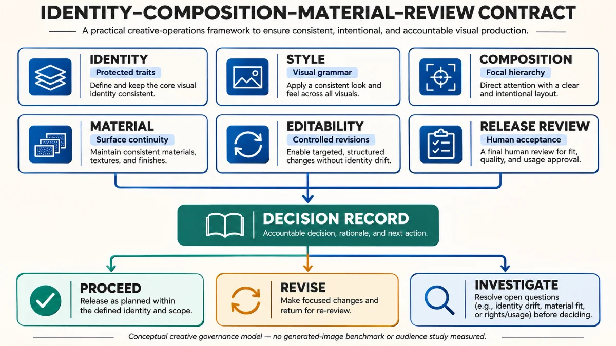
I would use the contract at two decision points: before generation, to agree on constraints, and before release, to verify them against the actual images. The decisive review question is not whether the prompt was followed word for word. It is whether the final asset fulfills the identity and communication requirements that justified the image in the first place.
Decisions should be proceed, revise, or investigate
The disposition options are PROCEED when the asset meets the documented criteria, REVISE when a correctable visual defect is understood, and INVESTIGATE when the cause or rights status is uncertain. These categories are intentionally qualitative. I would not fabricate a universal numerical threshold, because different projects place different risks on character drift, product accuracy, decorative variation, and legal clearance.
A review record should capture the asset version, reference versions, issue description, proposed correction, reviewer, disposition, and next review trigger. That makes image consistency a traceable collaboration process rather than a cycle of subjective feedback sent as isolated chat messages.
What to Lock, What to Allow, and What to Test
The most valuable part of an art direction system is its boundary between invariance and flexibility. The central image consistency decision is which visible properties must withstand changes in scene and format. Overly rigid restrictions can produce visually monotonous campaigns; overly flexible ones create an incoherent family. I would therefore separate three types of requirements: locked traits, adaptive traits, and independently testable constraints. This decision structure helps a team preserve image consistency without confusing it with sameness.
| Element | Locked | Allowed to vary | Test |
|---|---|---|---|
| Hero object | Silhouette, functional joints, material family | Camera angle and environment | Compare detail crops with master reference |
| Palette | Relative dominance of ivory, charcoal and cobalt | Local tone based on scene lighting | Inspect side-by-side at equal brightness |
| Composition | One clear focal subject and text-safe region | Perspective and focal distance | Check hero, thumbnail and narrow crops |
| Typography | No AI-generated final title text | Editorial copy added in design software | Check exact words and legibility |
| Supporting elements | No invented brand or product markings | Nonessential props and atmosphere | Review for factual or rights conflicts |
| Delivery | Target aspect ratios and source record | Output file sizes and derivative crops | Inspect exports on final surfaces |
This table is an illustrative design proposal, not a report from a completed commission. It shows why a single aesthetic adjective is inadequate: each row names a particular kind of drift and a practical way to detect it. In my view, the strongest image consistency workflows make the intended tolerances visible before the team becomes attached to a striking but incompatible result.
A Controlled Three-Image Production Scenario
Concept: a fictional observatory product narrative
Consider a fictional editorial series for an unbranded observatory concept. The scenario provides a way to discuss image consistency without inventing real-world outcomes. The three required images are a wide exterior cover, a close-up of an instrument station, and a human-scale interior route. The consistent identity is a restrained combination of limestone, charcoal metal, translucent glass, and one cobalt structural accent. The scenes should be different, but they must feel like parts of the same world. This is a design exercise, not evidence that these images have been generated or validated.
I would first approve one master style board and a handful of material references. Next I would establish each image’s communicative task and composition constraints. Only then would I generate candidates, keeping the tool version and reference set attached to each result. An image consistency review would compare all three images together, not merely inspect each image at its native size.
Two plausible failures and the correct response
Failure one: the wide exterior maintains the reference palette, but the interior converts the charcoal frames into polished chrome. This illustrates image consistency failure caused by a material mismatch rather than a completely wrong subject. The problem is material continuity. I would attempt a constrained edit to correct the frame finish while preserving the approved interior layout. A new prompt that repeats “charcoal” ten more times may work, but it is a less controlled first response than editing the defective property.
Failure two: the close-up preserves the material palette but adds unfamiliar controls to the instrument. That is not simply a style issue; it is a factual or product-identity issue. If the object represents a real design, a generated invention may be unacceptable. I would compare against the approved object source and either reconstruct the accurate features or reject the asset. Aesthetic quality is not a substitute for representational accuracy.
Why the approval gate matters
Suppose the three visuals look compelling alone but the second one changes the product silhouette. Without an explicit review owner, the team may rationalize the discrepancy as harmless creative variation. The contract makes the question answerable: was the silhouette protected, and does the output preserve it? If not, the disposition is revise or investigate. That is how image consistency becomes a design decision with consequences rather than an opinion contest.
Editing Is Part of Art Direction, Not Evidence of Failure
Prefer local correction when the global composition is already approved
The first successful output does not have to be the final one. A planned editing stage can strengthen image consistency without discarding every approved choice. Generative editing can preserve large parts of an image while changing a selected detail or building on a reference. OpenAI’s documented image workflows describe editing source images and iterating over earlier results, while current Midjourney tools support localized editing and expanding a scene. These features make it possible to treat an approved draft as a controlled production asset rather than a disposable prompt result. OpenAI’s image generation documentation describes the available editing workflows.
For image consistency, the decision is whether to edit a specific defect, regenerate a whole frame, or use traditional design tools. I would edit when the defect is isolated and the image’s other characteristics are worth preserving. I would regenerate when the composition itself is wrong or the model has invented too many interdependent details. I would use manual design or compositing when exact typography, logo integrity, and geometric fidelity are nonnegotiable.
Protect the approved image against edit cascades
Multiple generations of edits can introduce new drift. Image consistency must therefore be reassessed after each substantive edit, not only after the initial generation. Correcting the texture might alter the shape; fixing the shape might change the light; reworking the light might disturb the background. I would save a baseline version, apply one targeted change at a time, compare before and after, and keep an edit log. Prompt versioning alone is not enough, because it records instructions without ensuring that the visual evidence and underlying reference state are preserved.
The safest creative workflow allows a reviewer to roll back a bad revision. That requires retaining source files and earlier approved outputs instead of treating the last generated image as the only available truth. The capacity to recover a version is a practical part of image consistency, especially when several people are approving changes.
Use a Visual QA Protocol, Not a Gallery of Favorites
Review at the scale and context of real use
A pleasing full-resolution preview may conceal defects that become obvious when images sit side by side. That is why image consistency review belongs at the batch level as well as the asset level. I would evaluate the complete family on one contact sheet, then inspect critical details at appropriate scale, and finally check every planned export. This three-level visual QA process helps reveal palette drift, composition imbalance, awkward crops, unintended artifacts, and inconsistent material surfaces.
A reviewer should also examine whether each asset works with its surrounding content. A website hero with text overlay has different constraints from a portfolio thumbnail. A mobile feature card may require a simpler focal subject than a landscape editorial cover. Cross-surface review is necessary because image consistency should preserve both identity and the image’s actual communication purpose.
Do not confuse reviewer agreement with audience evidence
A design team may agree that the images share one style, but that is not proof that an audience recognizes them as a coherent identity. Image consistency is a professional review finding until a relevant audience study supplies independent evidence. Real recognition claims would require appropriate participant research or observed behavior. I would report internal review as a qualitative production judgment and avoid turning that judgment into a fabricated “consistency score.” No such measurements are supplied in this article.
| Check | Evidence | Fail condition | Preferred next action |
|---|---|---|---|
| Identity preservation | Master reference and detail crops | Critical silhouette or feature changes | Local edit or reject |
| Style coherence | Approved reference board and contact sheet | New palette or rendering grammar appears | Adjust reference or edit |
| Material accuracy | Material sheet and high-resolution crop | Wrong finish, texture scale, or reflectivity | Constrained surface correction |
| Communication | Final crop and usage context | Subject or text-safe area lost | Recompose the asset |
| Rights and disclosure | Permission records and publication requirements | Unresolved source rights or misuse risk | Hold release and investigate |
| Export integrity | Final delivered files | Broken ratio, clipping, compression, or text | Repair export and recheck |
The Cost of Rework Is a Creative Production Variable
Many teams compare image tools by generation speed or number of drafts produced. Image consistency changes the denominator: usable approved assets matter more than raw drafts. I would also examine the time spent choosing references, reviewing variants, correcting drift, preparing exports, and coordinating approvals. A system that produces many attractive candidates may still have a high cost per usable asset. That matters when image consistency must survive twenty deliverables instead of two.
One useful non-monetary planning equation is: usable deliverable effort = initial direction + reference preparation + generation + review + correction + final production. This is a conceptual accounting identity, not a benchmark. It encourages teams to measure the whole production cycle rather than infer efficiency from the number of images generated in a short session.
I would track specific rework reasons rather than vague dissatisfaction: subject drift, material drift, composition failure, text errors, rights concerns, and export failure. Over time, actual project records could reveal whether improvements in art direction reduce correction effort. Without such records, it would be misleading to claim a particular percentage improvement from this framework.
When Generative Images Should Not Be the Primary Source
Some jobs require more precision than a model can reliably deliver in a given workflow. Image consistency is not sufficient if the output is factually inaccurate or unsafe for its intended use. Technical product diagrams, regulated labeling, exact logos, legible data graphics, and spatially faithful illustrations may be better constructed with controlled design tools or rendered from verified source assets. A generative model can still contribute to ideation, environment exploration, or background treatment without becoming the authoritative source for every visual element.
This distinction protects both the audience and the creative team. For example, if a diagram must display exact instructions or numerical information, I would construct and validate the diagram independently. The model can propose an art direction, but the information layer should be tested as actual text and geometry. Image consistency is not only about aesthetic continuity; it includes the integrity of meaning between assets.
Similarly, when a real person’s likeness or an owned brand asset is involved, the rights and consent check comes before stylistic approval. A team should not use a technically feasible workflow to bypass obligations that apply to the intended output. The U.S. Copyright Office’s work provides useful context, but legal and contractual obligations differ across jurisdictions and uses.
What Different Tools Actually Control in 2026
The current tooling landscape illustrates why the workflow needs a model-agnostic contract. Image consistency should be specified independently of whichever generation interface is available this month. Adobe Firefly separates style and composition references and offers controls for reference strength. Midjourney provides Style Reference and a newer Edit Model for reference-driven generation and corrections. OpenAI documents source-image editing and staged refinement. These tools overlap but do not expose identical controls, so image consistency should be defined at the project level before being implemented through any particular interface.
| Production need | Relevant documented capability | Editorial limitation |
|---|---|---|
| Aesthetic matching | Adobe Firefly style reference; Midjourney Style Reference | Style controls do not establish exact subject fidelity |
| Composition guidance | Adobe Firefly composition reference | Layout matching does not guarantee communication quality |
| Object/character continuity | Midjourney Edit Model with visual references | Small identity details can still vary |
| Selective correction | Midjourney editor; OpenAI image editing | Edits can change unintended regions and require review |
| Cross-tool reproducibility | Saved reference boards, source files and decision record | Prompt strings are not universal visual specifications |
Features and model behaviors change. For that reason, I would keep live technical settings in a versioned production note and keep the higher-level art direction contract stable. A short note saying which reference control was used, under which model version, with which approved images, is more useful than claiming that one tool permanently solves image consistency.
Copyright, Ownership, and Publication Claims
A successful series can still be unsuitable for publication if ownership, license, attribution, or consent remains uncertain. Image consistency and legal clearance are separate acceptance decisions. Legal review should distinguish inputs, outputs, human-authored editing, contracts, model terms, and the publication context. I would retain documentation for the origin of references and clarify whether the output is an original conceptual illustration, a product rendering, a photograph, or a reconstruction. These are different claims with different consequences.
The U.S. Copyright Office states that copyright may protect human-authored expressive contributions in AI-assisted work, but that mere prompt text is not automatically enough to claim protection over all resulting expression. This does not mean every edited AI image is protectable or unprotectable; the contribution and facts matter. It also says nothing by itself about whether an input image was lawfully used. The professional response is to document what was contributed and obtain appropriate review where necessary. U.S. Copyright Office: Copyrightability report announcement.
I keep a second distinction in view: image consistency is not provenance. A series may be visually consistent without reliable records of how the assets were created. Conversely, an asset can retain verifiable production metadata and still be inconsistent with the design brief. Provenance technology deserves its own analysis; it should not be treated as proof of aesthetic quality, legal ownership, or factual truth.
A Practical Workflow for Creative Directors and Small Teams
Preproduction: one approved visual system
I would begin with a concise visual system containing identity rules, approved style and composition references, material details, use cases, required aspect ratios, and explicit prohibited alterations. Image consistency starts with this shared source of truth. A single named decision owner should approve this before large-batch generation. The brief should specify which attributes are flexible and which are release blockers. In small teams, this can be a lightweight document rather than an elaborate governance platform.
Production: controlled variants and visible changes
Create a limited set of candidate images, evaluate them as a family, and preserve their reference and prompt versions. When drift appears, classify it before requesting a change. Use localized edits for isolated defects and full regeneration when the overall direction is wrong. Avoid adjusting many variables simultaneously if you want to understand why image consistency improved or deteriorated.
Release: accountable human review
Review the contact sheet, critical detail crops, final placements, rights status, and export integrity. Record a proceed, revise, or investigate decision. Publish only approved assets, and keep the revision trail in case an image later needs correction. I would treat this as the minimum viable creative operations discipline for an AI-assisted visual series, not as proof of audience recognition or a universal certification of quality.
Evidence, Limits, and What Would Validate This Framework
The evidence in this article comes from public product documentation describing reference and editing controls, general creative-direction reasoning, and the U.S. Copyright Office’s published analysis of copyrightability. No image consistency benchmark is claimed. My Identity–Composition–Material–Review Contract is an original synthesis of those ideas. It has not been evaluated in a controlled experiment, and no measured client outcomes or model benchmark results are claimed.
A meaningful validation study would use the same visual brief and a defined set of scenes across two production workflows: prompt-only and reference-plus-review. Evaluators should be blinded to the workflow where feasible and assess predefined identity defects, material drift, task suitability, revision effort, and final release quality. The study would need consistent model versions, source rights, independent reviewers, and documented exclusion criteria. Different scene complexity and reviewer expectations would remain major validity concerns.
Until such work is done, I would present the framework as a disciplined decision method, not a proven guarantee. The most useful insight is still actionable: image consistency becomes easier to discuss and correct when the team can name the invariant, show the relevant reference, point to the defect, and assign a justified next action.
If You Only Read One Thing
The question is not “Can a prompt produce a great image?” Image consistency asks a more demanding production question. It is “Can a team intentionally produce a family of images that remains recognizable, truthful to its brief, editable, and fit for publication?” My answer is to move art direction into the production system: define identity, constrain composition and materials, preserve references, localize edits, and review the entire set. That is how I would make image consistency a professional design responsibility instead of an endless prompt-rewriting exercise.
Related Reading and Author Note
This analysis extends the distinction between invariant principles and adaptable visual compositions discussed in Visual Language Across Formats: A Flexible Design System. For additional original work about creative and interactive production systems, browse Digital Creation Articles.
Author’s note: This is an analytical article by Recep Emre Ercetin about creative process and production governance. The proposed contract and fictional observatory example are conceptual, not performance studies, client testimonials, or documented generated output evaluations. Information about product features was reviewed for November 4, 2026 and should be rechecked as tools evolve.
Connect for related work on LinkedIn, X, Threads, GitHub, and Behance.