


Human Oversight in AI: Review, Escalation, Accountability

Sustained Performance: Beyond Peak Benchmarks

Role-based information architecture becomes difficult when a product serves people who share the same platform but not the same responsibilities. A finance analyst may need to reconcile invoices, a workspace administrator may need to configure access, and a support specialist may need to investigate an account problem without viewing restricted financial details. All three people can sign in successfully and still find the product difficult to navigate for entirely different reasons. The problem is not necessarily the number of menu items. It is whether the structure makes the right tasks findable, explains the context of those tasks, and respects boundaries that the interface itself does not enforce.
I would not start by drawing a separate sidebar for every organizational role. Job titles are imperfect descriptions of work, and access rights are not a substitute for understanding how people think about their goals. A user may hold several roles, move between workspaces, or carry out the same task under different conditions. If navigation is built directly from a permissions table, the resulting product can be technically restricted yet conceptually incoherent.
My approach is to separate three questions: What is this person trying to accomplish? Where would they expect to find the relevant object or action? What may they actually see or do in the current context? This article develops a Task–Role–Findability Matrix to connect those questions without collapsing them into a single role label. It is a proposed design and evaluation framework, informed by established UX and access-control principles, not a validated industry standard or a report of a completed user study.
Decision Brief: Design Around Tasks, Then Apply Permissions
The problem: Teams often mirror backend modules or organization charts in navigation, then hide unavailable menu entries and assume the experience is role-appropriate.
The principle: Build a comprehensible task and content structure first; use trusted permission decisions to determine which objects and actions can be exposed, not to define what every label means.
The method: Map each important task to a user context, expected destination, navigation cue, access requirement, failure state, and validation question.
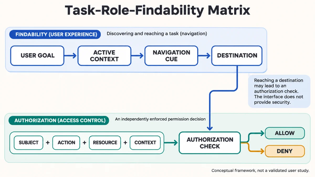
The limit: A well-organized interface does not secure a resource. Authorization must be enforced by trusted application services, and a conceptual matrix does not prove that users can find tasks without research.
Role-Based Navigation Is Not an Organization Chart
In role-based information architecture, the phrase role-based navigation can describe several distinct design decisions. A product might display different tools to administrators and operators, prioritize frequent actions for particular jobs, or allow people to select an active workspace. Those patterns may look similar in screenshots, but they answer different questions. Visibility answers what appears in the interface; prioritization answers what receives attention; workspace scope answers which environment is active; authorization answers whether an operation is permitted.
A classic mistake is treating an internal department name as a universal navigation category. A financial operations team might call something “Settlement Management,” while a new support agent thinks in terms of “Find a Payment.” Neither label is inherently wrong. One describes an organizational function and the other describes the task. The correct architecture depends on the users, their vocabulary, and the way the system connects objects and actions.
The Nielsen Norman Group’s explanation of mental models is useful here: what users believe about a system shapes where they look and what they expect to happen. A product team’s conceptual model may differ from the user’s. I would expose that difference early instead of interpreting every failed navigation attempt as a request to rename a menu item.
Separate Roles, Contexts, and Tasks
A role is a bundle of responsibilities or permissions within a particular system. A context can include the active organization, workspace, account, project, resource state, or delegated assignment. A task describes the outcome the person is trying to achieve. These dimensions overlap, but none reliably replaces the others. An administrator in Workspace A may be a viewer in Workspace B; a support specialist may be allowed to inspect an incident but not modify the customer’s billing details.
Consider the task “review an invoice.” That goal might mean checking whether a payment posted, examining an exception, preparing an export, or approving a correction. A single menu item labeled “Invoices” may be appropriate as an entry point, but the downstream journey should clarify which object, status, and permitted action the person is handling. Designing from role names alone loses that specificity.
Multiple Roles and Role Switching
Role-based information architecture becomes harder with role switching: the same person may have more than one legitimate working context. If changing a workspace silently changes available actions, users may conclude that features have disappeared or that the application has lost information. The interface should make the active context recognizable, preserve orientation where possible, and explain why a task is unavailable when doing so does not reveal sensitive information.
I would not assume that a separate layout for every role is the answer. Separate experiences can simplify highly distinct workflows, but they also create divergent terminology, duplicated maintenance, and costly transitions for people who cross responsibilities. Sometimes a stable shared structure with carefully scoped task surfaces provides a better balance.
Permission-Aware UX Without Treating the Menu as Security
In role-based information architecture, permission-aware UX should communicate what is relevant and actionable for a person, but the interface is only one consumer of access decisions. The OWASP Authorization Cheat Sheet recommends denying access by default and validating permissions on every request. A hidden control does not enforce either requirement. An API, export job, direct link, or background operation must still check whether the requester may perform the specific action on the specific resource.
This distinction matters even if a navigation layer receives a reliable capability description from the server. That description can improve the experience by avoiding dead-end actions, but it may become stale after a role change or revocation. A resource-level check at the trusted execution boundary remains necessary. The architecture discussed in my authorization architecture analysis explores the policy and enforcement side; this article focuses on how those boundaries should affect user comprehension and wayfinding.
Least Privilege Does Not Mean Minimum Explanation
Least privilege is an access-control principle: users should have only the permissions necessary for their legitimate work. It is not a command to make the product mysterious. If someone can view an invoice but cannot approve it, the interface may need to show the invoice’s status and an appropriate explanation of the missing action. Conversely, displaying the existence, title, or metadata of a restricted document can itself leak information. The disclosure decision must come from a deliberate policy, not from a blanket “always show disabled controls” rule.
I would distinguish three interface states. An available task is visible and executable. A known but unavailable task may be visible with a safe explanation, when the user’s legitimate work requires awareness of it. A confidential task or resource must not be disclosed merely to improve discoverability. The product team and security owners should agree on these boundaries before a designer chooses between hiding, disabling, or explaining an action.
Build a Capability View, Not a Security Claim
An application can derive a scoped view of capabilities to inform navigation: for example, whether the current user can inspect billing records in the active workspace or request an export. But a capability name such as reports.export does not necessarily authorize exporting every report in every tenant. The final operation still needs its resource and context checks. In design documentation, I would label the capability view an interface aid, not an independent enforcement mechanism.
Permission-aware UX also needs predictable behavior when conditions change. A button that disappears after a refresh, a bookmarked page that becomes inaccessible, and a long-running task that loses authorization require different recovery messages. “Not found,” “access denied,” and “this action is no longer available” should not be chosen casually, because each communicates a different interpretation and can carry different disclosure risks.
Enterprise Information Architecture Needs a Stable Vocabulary
Role-based information architecture in enterprise products often grows module by module. Billing gets its own menu, analytics gets another, and administration accumulates settings that were convenient to implement rather than convenient to locate. This can produce an interface in which every team recognizes its own component but no user can explain the whole structure. As the product expands, inconsistencies between labels, object types, and cross-module journeys become more expensive than an isolated navigation complaint.
I would define a compact vocabulary for the main objects and outcomes before selecting a visual layout. If “customer,” “account,” “organization,” and “workspace” refer to different concepts, the interface must use them consistently. If they refer to the same concept, inconsistent labeling may create avoidable uncertainty. A glossary can help the design team, but users should not need to read one to operate the product.
Information Scent and Task Expectations
Information scent describes the cues people use to estimate where a link will lead and whether it is worth following. The Nielsen Norman Group’s information-scent guidance emphasizes link labels, surrounding context, and users’ prior knowledge. “Operations” may have strong meaning for the product team and weak meaning for a new administrator seeking a failed payment. “Failed Payments” may be the clearer task cue, even when that destination technically belongs to the operations module.
In role-based information architecture, good information scent does not require every menu label to be a full sentence. It requires a defensible relationship between what people seek, what they expect to see, and what they find after choosing a path. When a label is unavoidably broad, contextual descriptions, object names, page headings, and search results can make the route more legible.
Cognitive Load: Do Not Make Users Remember the Architecture
In a complex product, users already need to remember policies, project status, customer context, and the consequences of an action. Navigation should not add a demand to remember where an obscure feature was placed last month. The research-based distinction between recognition and recall supports providing recognizable options and contextual cues rather than relying on memorized commands or internal terminology.
Reducing cognitive load does not always mean showing fewer items. Hiding a necessary task behind an unfamiliar generic category may force more memory and exploration than showing an accurately labeled option. I would evaluate visible complexity alongside task clarity, the number of wrong turns, and the effort required to recover. A minimal-looking sidebar can still produce a demanding workflow.
Navigation Consistency Across Roles
Consistency helps users transfer learning between areas. WCAG 2.2 Success Criterion 3.2.3 addresses the relative order of repeated navigation mechanisms across pages, subject to user-initiated changes. It does not prohibit role-specific links, secondary navigation, or responsive layouts. The design task is to maintain predictable shared patterns while allowing necessary differences in what each person can access.
I would keep common destinations, labels, object relationships, and navigation behaviors as stable as practical. Where a different role genuinely needs a different entry point, the difference should be understandable rather than arbitrary. Accessibility also involves meaningful keyboard focus order and clear headings; a visually consistent layout can remain difficult to use if its interaction order does not preserve meaning.
The Task–Role–Findability Matrix: An Editorial Decision Framework
My proposed Task–Role–Findability Matrix is a way to review role-based information architecture decisions before teams encode them in page templates. Each row starts with a user goal and links it to the current context, expected information destination, authorization boundary, and a question that research could answer. The framework is not a scoring model and does not replace either an access-control policy or a usability study.
For clarity, the following example describes a hypothetical multi-workspace billing platform. Its roles, tasks, navigation paths, and failure risks are illustrative design assumptions, not observations from a live product or results measured with participants.
| User and goal | Expected destination | Access boundary | Findability question |
|---|---|---|---|
| Finance analyst reviews an unpaid invoice | Billing → Invoices → Unpaid | Read permitted invoices in active workspace | Can the analyst locate the correct invoice without knowing its internal status code? |
| Billing administrator approves a credit adjustment | Billing → Adjustments → Review | Approval authority for this resource and state | Is review distinguishable from creating or viewing an adjustment? |
| Support specialist investigates a reported payment failure | Support → Payment Issues | Restricted diagnostic view; no protected finance export | Does the path explain what information can be inspected without exposing restricted details? |
| Workspace administrator invites a team member | Workspace Settings → Members | Membership-management permission in selected workspace | Can the administrator recognize which workspace will receive the invitation? |
What Each Matrix Row Must Explain
I would record six details beyond the visible navigation label: the task outcome, the user’s relevant experience level, the active workspace or resource context, the vocabulary the person would use, the expected permission behavior, and the condition that would count as successful navigation. The same task can require different entry points for a first-time administrator and an experienced operator without requiring different underlying resources or security policies.
The matrix also needs a negative case. What should happen if a support specialist opens a saved deep link to a restricted billing record? Which information, if any, can the system safely disclose? Can the person reach a permitted alternative without losing context? If a design review tests only happy-path menu clicks, it will miss precisely the transitions that make role-based experiences hard to reason about.
Use the Matrix to Compare Alternatives, Not Declare a Winner
One team may propose distinct role homepages; another may prefer a common navigation structure with task shortcuts. The matrix makes those alternatives inspectable. A role homepage can reduce irrelevant options for specialized users but increase switching costs for cross-functional work. Shared navigation can improve consistency but expose too many competing routes when labels are vague. Neither pattern wins merely because it seems cleaner in a mockup.
I would compare candidate structures against the same representative tasks, including infrequent but consequential actions. If a proposal improves the most common task while making account recovery, approval review, or cross-workspace orientation unreliable, the trade-off should be visible. The matrix’s purpose is to prevent a polished layout from concealing a poor decision about task access and comprehension.
Task-Based Navigation Patterns and Their Trade-Offs
Task-based navigation is a useful counterweight to navigation built around departments or software modules, but it can be overapplied. A top-level menu made entirely of verbs becomes unwieldy when users must inspect the same underlying object through many actions. A noun-based structure can work well when objects are stable and understood. I would choose the primary organizing principle based on whether people approach the product thinking about an object, an outcome, or a sequence of steps.
A Stable Core With Contextual Task Surfaces
For many multi-role products, I would evaluate a shared core structure first: a consistent set of familiar objects or product areas, supplemented by contextual actions and role-relevant starting points. This is not a universal rule. It is an attempt to avoid multiplying entire navigation systems when the underlying information model is shared. A workspace switcher, for example, should communicate a change in scope without redefining every object name.
A contextual task surface might show “Review pending adjustments” to an eligible billing administrator and “View adjustment history” to an analyst. The tasks differ, but both can connect to a coherent adjustment object model. If an action becomes unavailable, the destination should still help the user understand the next legitimate step when policy permits that explanation.
Search, Shortcuts, and Deep Links Are Supporting Paths
In role-based information architecture, search can help experienced users bypass a hierarchy, and shortcuts can improve repeat workflows. Neither compensates automatically for poor information architecture. Search requires users to know usable query terms and may expose unauthorized titles or snippets unless results are filtered at a trusted boundary. A shortcut can become stale when the active context changes. A bookmarked deep link needs an accessible destination, a clear active-workspace cue, and correct enforcement when permissions differ from the last visit.
I would include search and deep links in the navigation audit because users do not always enter through the homepage. They arrive from notifications, shared links, browser history, and support instructions. An architecture that works only when people begin in the sidebar does not describe the complete experience.
Progressive Disclosure Without Concealing Essential Work
Progressive disclosure can reduce distraction by presenting advanced configuration when it is relevant. But it becomes counterproductive when users cannot predict where an essential function will appear. A rarely used destructive action may deserve a secondary location and explicit confirmation; a time-sensitive exception queue may need prominent access for the people responsible for it. Frequency alone should not decide visibility. Consequence, task urgency, user expertise, and recovery cost also matter.
The important distinction is between reducing irrelevant choice and hiding the system’s logic. I would rather explain a complex but meaningful structure than produce a minimalist surface that requires institutional knowledge to navigate.
Validate the Structure With Card Sorting and Tree Testing
Role-based information architecture should be tested as a set of user expectations, not assessed only through designer review. Nielsen Norman Group distinguishes card sorting from tree testing: card sorting helps explore how people group and label items, while tree testing evaluates whether a proposed hierarchy lets people locate specified destinations. They answer related but different questions. Neither method alone establishes whether a protected operation is correctly authorized.
Card Sorting: Discover the Vocabulary
I would consider card sorting when the main uncertainty is how different user groups conceptualize content. Participants might group invoices, credits, payment disputes, customer records, and reporting functions differently. The useful result is not necessarily one universal tree; the study may reveal that two audiences use different labels for the same object or expect different relationships between tasks.
A card-sort exercise should include representative material and a purposeful participant sample. I would not turn categories generated by a handful of participants into a population-wide preference claim. Qualitative comments about why items belong together may be more useful than a superficial consensus percentage, especially when the product serves distinct professional roles.
Tree Testing: Measure Task Success and Wrong Turns
Once the hierarchy and labels have been proposed, a tree test can ask participants to locate destinations without relying on visual decoration, icons, or dashboard cards. I would give people task scenarios in their own language, avoiding clues that reproduce menu labels. The intended destination must be defined before analysis, and the test should reflect the role and scope relevant to the task.
Useful observations include direct task success, eventual success after backtracking, incorrect first destination, abandoned searches, and the paths people choose. Completion time may help interpret friction but should not be read alone as proof of understanding. A participant can reach a destination quickly and still misunderstand the consequences of the action. An unsuccessful attempt may reflect a misleading label, a mistaken mental model, or an unrealistic task scenario; the study design must leave room to distinguish them.
Test Access Decisions Separately From Findability
I would pair navigation research with a separate permission test plan. Tree testing answers where participants expect to find something. Authorization checks answer whether the application permits the correct subject to access or modify a particular resource under specified conditions. A participant should not be asked to infer security correctness from a static tree, and a passing API permission test cannot tell us whether users can discover a permitted workflow.
When findings disagree, I would align the population, tasks, product version, and measurement boundary before choosing a redesign. The UX research triangulation guide develops a method for reconciling that kind of evidence without treating interviews, analytics, and task observations as interchangeable measurements.
Accessibility and Recovery Across Role Changes
Navigation consistency in role-based information architecture is also an accessibility concern. A keyboard user needs a meaningful focus sequence and predictable places to find repeated controls. WCAG 2.2’s focus-order guidance addresses preserving meaning and operability when navigation is sequential. The interface must be reviewed with actual keyboard and assistive-technology paths, not only visual screenshots. I would also inspect whether navigation names and page headings communicate the selected object and action clearly.
Role changes can create unusual accessibility failures. A user may submit a form while an administrator revokes permission; a menu item may vanish while keyboard focus is nearby; a modal may close into a destination that no longer exists. The correct recovery depends on the product state and policy, but the user should not be stranded with an unexplained visual change. Status messaging, focus restoration, and safe alternatives deserve explicit design attention.
These examples are potential failure modes to test, not observed defects in a named product. I would include them in a release review because they cross UX, frontend implementation, and authorization boundaries. A navigation design can satisfy a static review while failing precisely when the user switches context, follows a saved link, or encounters an expired permission.
Governance: Keep Navigation and Access Models Aligned as the Product Grows
Even a well-tested role-based information architecture can deteriorate when teams add modules independently. A new feature may introduce a duplicate label, a second route to the same object, a permission name that UI designers misinterpret, or an inconsistent workspace selector. I would treat navigation changes as product architecture decisions with explicit owners, affected roles, and regression scenarios rather than isolated interface tickets.
For a proposed addition, the review should ask whether the concept is already represented, who legitimately needs it, which entry points people will expect, what happens under insufficient permissions, and which existing tasks might become harder to find. A small content inventory and stable naming contract can prevent costly divergence. When terminology must change, redirect and education strategies may be needed so returning users are not forced to relearn the entire product at once.
My preferred release checks are concrete: each representative role can reach its critical permitted tasks; restricted actions remain protected even through direct requests; workspace changes are understandable; navigation labels and repeated controls remain consistent; keyboard interaction preserves orientation; and a user with revoked or insufficient access reaches a safe, intelligible state. These are proposed acceptance checks, not claims about a completed audit.
Evidence and Methodology: What This Framework Can Establish
The design principles in this article draw on published work about mental models, information scent, recognition versus recall, card sorting, tree testing, accessibility, and access-control boundaries. The Task–Role–Findability Matrix is my synthesis of those concerns into a practical review format. The cited sources support the underlying distinctions; they do not validate the exact matrix, its field choices, or a particular enterprise navigation pattern.
No participant research, tree-test benchmark, accessibility conformance audit, or permission penetration test was conducted for this article. The billing example is hypothetical. There are no measured success rates, task times, or before-and-after results to report. Before adopting this framework in a high-impact system, teams would need appropriate user research, technical authorization testing, and accessibility evaluation for the real application and its actual users.
The framework has a further limit: a task map can document what users should be able to accomplish, but it cannot resolve conflicts over policy ownership or decide which business roles deserve access. Those are governance questions requiring authoritative product and security decisions. UX can make their consequences understandable; it cannot replace them.
Frequently Asked Questions
Should each role have a completely different navigation menu?
Not by default. Separate menus can help when responsibilities and mental models genuinely differ, but they can also fragment vocabulary and complicate role switching. Compare a stable shared structure with contextual role-specific paths against the same representative tasks before deciding.
Is hiding a menu item enough to restrict a feature?
No. Hiding a link is a presentation decision, not an authorization boundary. The application must validate the requested action and resource at trusted enforcement points, including direct requests, exports, and other execution paths. Whether an unavailable task should be visible also depends on disclosure policy and user comprehension.
When should I choose card sorting instead of tree testing?
Use card sorting to explore possible groups and vocabulary when the structure is not yet understood. Use tree testing to evaluate whether people can locate destinations in a proposed hierarchy. If the question concerns whether someone can safely execute a privileged operation, add separate permission and workflow tests.
What metrics matter for enterprise navigation?
Start with task success and the user’s path to a defined destination. Review wrong first choices, backtracking, assistance, recovery, and comprehension of the destination. Segment findings by relevant role and context. Do not generalize a small qualitative sample into a population success rate without an appropriate quantitative design.
How should the UI explain unavailable actions?
Use the least revealing explanation that still supports legitimate work. Some unavailable actions can be shown with a clear status or request-access path; confidential resources may need to remain undisclosed. The correct choice depends on the actual policy and the risk of exposing sensitive information.
Conclusion: Make the Work Findable Without Confusing It With Authority
The challenge in role-based information architecture is not to produce the smallest menu for each job title. It is to give people a coherent understanding of where work lives, what a destination means, and which actions are available in their current context. A product can pass an access-control review while leaving users unable to locate permitted tasks. It can also feel elegantly personalized while exposing inconsistent or insecure execution paths. Those failures belong to different disciplines and need different evidence.
I would begin with representative tasks, preserve a stable vocabulary wherever it improves orientation, map the consequences of role and workspace changes, and validate proposed paths through appropriately designed research. Permission decisions should shape what the interface may reveal, while the underlying application remains responsible for enforcing those decisions. The Task–Role–Findability Matrix makes that separation explicit so teams can review both the usability of a route and the authority required at its destination.
The most useful outcome is not universal agreement on one sidebar layout. It is a navigation architecture that can explain its choices, expose its trade-offs, and change when research shows that the product’s internal model does not match the way people actually work.
More From the Author
Explore additional research and design decisions in my UX & UI Design Articles collection.
For related work on software engineering, product decisions, and UX research, find my professional profiles on LinkedIn, X, Threads, GitHub, and Behance.